
Recently I came across this series of illustrations Robert Heindel painted for Reader's Digest Condensed Books in 1970. I've modified the layout of the first spread because I really wanted to include that fantastic title typeface, so typical of typography of the early '70s.

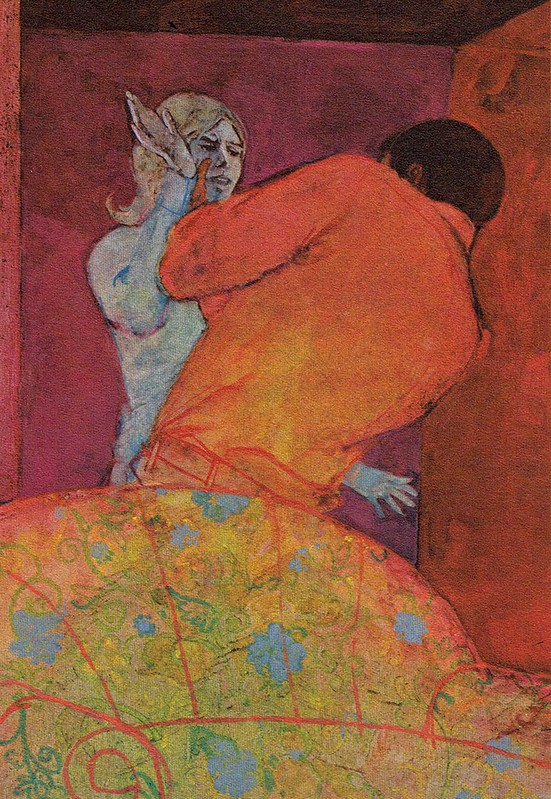
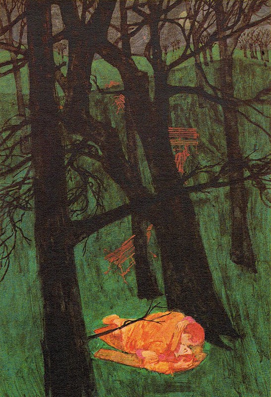
This group of illustrations really knocked me out. Heindel's technique on this series leaves an impression of both old and new styles of picture making.
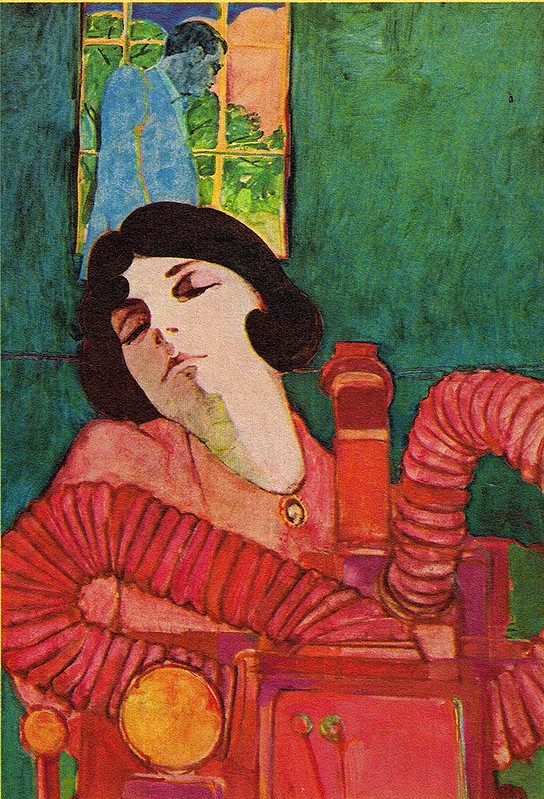
The juxtaposition is quite remarkable. I don't think I've ever seen anything quite like it.
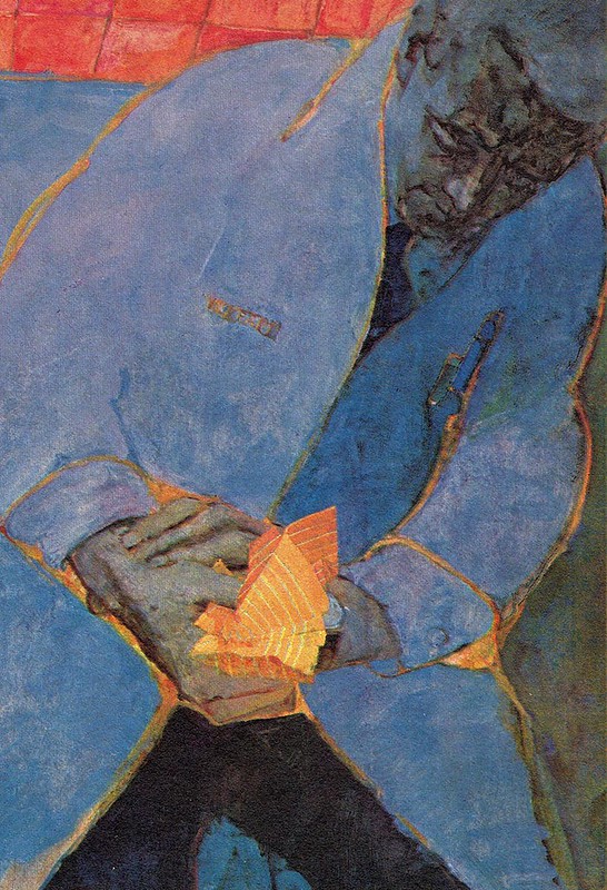
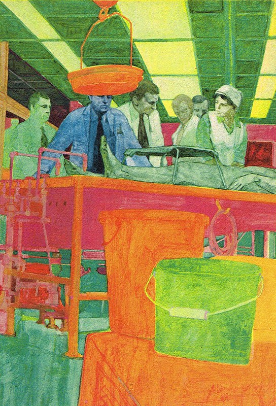
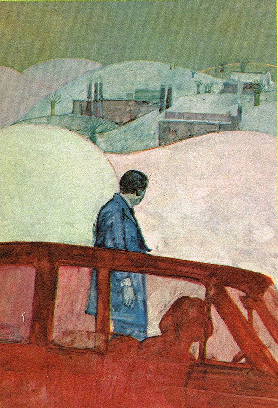
I only wish we could see this magnificent series under better printing circumstances. I'll bet the originals would be beyond belief.

Robert Heindel has previously been the subject of a week of posts on the TI blog. If you'd like to see more of his work and read about his career, just click on these links:
Part 1, Part 2, Part 3, Part 4, Part 5


via Today's Inspiration http://todaysinspiration.blogspot.com/2013/11/another-look-at-robert-heindel.html
This group of illustrations really knocked me out. Heindel's technique on this series leaves an impression of both old and new styles of picture making.
The juxtaposition is quite remarkable. I don't think I've ever seen anything quite like it.
I only wish we could see this magnificent series under better printing circumstances. I'll bet the originals would be beyond belief.
Robert Heindel has previously been the subject of a week of posts on the TI blog. If you'd like to see more of his work and read about his career, just click on these links:
Part 1, Part 2, Part 3, Part 4, Part 5
via Today's Inspiration http://todaysinspiration.blogspot.com/2013/11/another-look-at-robert-heindel.html
No comments:
Post a Comment