via Lines and Colors :: a blog about drawing, painting, illustration, comics, concept art and other visual arts http://ift.tt/1TF4uFB
As part of the huge trove of public domain images being posted on Flicker — which I reported in 2013 — the British Library has assemble a large collection of children’s book illustrations.
As is often the case with these kinds of large scale image resources, best results come from a bit of patience and digging.
Some of the illustrations are not directly attributed to the artists, but reference is given to the books from which they were taken.
This past Saturday was the presentation of this year's Spectrum Award Winners. The event was held at the Society of Illustrators in New York City. Every nomination was sincerely spectacular, but a special congratulations, to the award winners.
This year's medal winners are:
ADVERTISING
Gold Award
Nico Delort/"The Blessing of Athena”
Silver Award
Joseph Qiu/"24 Hour Movie Marathon"
BOOK
Gold Award
Rovina Cai/"Tom, Thom"
Silver Award
Karla Ortiz/"Sorcerer of the Wildeeps"
COMIC
Gold Award
Daren Bader/"Tribes of Kai, page 41”
Silver Award
Nic Klein/“Drifter"
CONCEPT ART
Gold Award
Vance Kovacs/"King Louie's Court"
Silver Award
Te Hu/"Journey to West"
DIMENSIONAL
Gold Award
Forest Rogers/"The Morrigan"
Silver Award
Te Hu/"Journey to West"
EDITORIAL
Gold Award
Tran Nguyen/"Traveling To a Distant Day"
Silver Award
Chris Seaman/"Family Portraithausen: A Tribute to Ray Harryhausen"
Over the last few months I have been listening to the unabridged Blackstone Audio of Moby Dick. Along the way the story has seeped into my thoughts and drawings. I present to you some work that I made along the way. As it turns out, I am a little obsessed with illustrating stories. Hmm, perhaps there a […]
Back in December of 2015 I was exhibiting at an arts and crafts fair and I got to talking to this guy who stopped by my table. After a while he asks, "Hey, have you ever heard of an artist named Sulamith Wülfing?"
The question caught me a little by surprise (it's not everyday that people want to talk 20th century illustrators, let alone bring up artists I've only just recently begun to study) and I said of course and that she's become a "new" favorite of mine.
In fact, I'd been introduced to her work by Sam Guay only a few months prior. Honestly, I have no idea how I'd never heard of Sulamith Wülfing before that. Her work is right up my alley. It's haunting, magical, and speaks to this delicate, graceful otherworldliness.
The guy tells me that he deals in estate sales, specifically antique books, and that he just acquired this nearly 200 page book of her work. He goes on to say that if I'd like it, the book is mine. He wanted the book to go to someone who would appreciate it. Next thing I know the guy has left the show, gone to pick up the book, and brought it back for me.
Other than a handful of images online I'd not been able to track down any kind of collection of Wülfing's work and now here I am, thanks to kindness of this collector, holding a huge book with page after page of not only paintings and drawings but her complete biography (which just so happens to be as fascinating as the work itself).
Born in 1901, she had visions of angels, gnomes, fairies, and elves her entire life. Sulamith described them as incarnations of "kind-heartedness" and drew upon them as the inspiration for her work. She lived through both World Wars (and in fact she was told by Joseph Goebbels that her illustrations were unacceptable and that she must stop; she refused).
"What I believe in absolutely, however, is the immortality of the soul, the primeval personality which has still much unfolding and further developments before it. How this happens and how it has happened, that remains - in any case at this moment - a secret."
Regular readers know that I'm a big fan of Tom Fluharty's sketches.
In an era when quality drawing is under-appreciated, Fluharty's strong, bold, insightful drawings stand out.
So I was particularly pleased when Fluharty announced the release of his splendid new collection of drawings, The Art of the Sketch. Looking through Fluharty's book, several lessons stand out.
I love this drawing of Ringo Starr:
It looks like it was drawn quickly, like the crack of a whip. Yet if you look more closely, you note that he paid attention to-- and drew-- each and every tooth individually.
You don't notice such details at first because Fluharty has the gift to capture them with a vigorous, energetic scribble rather than the painful cross hatching or stippling that many meticulous draftsmen use to capture details.
The point is not that Fluharty makes highly detailed drawings-- to the contrary, he often ignores major details.
The point is that Fluharty notices such details; when Fluharty has a pencil in his hand, not one feather falls from a sparrow unnoticed. And from that wealth of observations, he judiciously selects the details he thinks are important. In the drawing of Ringo, that smile is the centerpiece and Fluharty apparently felt that those ungainly teeth were worth the additional effort. We may not be conscious of them, but such details contribute a lot.
You see similar attention in this more finished drawing of Stan Lee.
Look at how much imagination Fluharty has invested in those gnarled old fingers still striking the "spidey" pose:
Or check out the wringing hands in this drawing of Hillary Clinton...
In both cases, you can tell that Fluharty decided that hands would be an important part of the story, and went back to add them to his drawing.
This is a fine collection of working drawings, and one that I enjoyed thoroughly.
Anima the Dreadful (Conan) - Oil on wooden board, 70X50 cm, 2015.Private commission.
Back in the eighties, when I was studying art at the Novi Sad Art Academy in Serbia, we had a teacher of Art History, an elderly lady whotold us that, once in her youth, she had met Picasso, and even had got from him one of his famous painted vases as a present. She mentioned this little anecdote often, and not without a certain amount of pride and self-contentment. This little lady used to say: “No one is born without a mother and a father”. The message of her saying was obvious - every person, creator and artist, has his own roots, his creative parents, his springboard. We all had teachers, mentors and role models at the beginning of our art career who helped us and showed us the way, motivated and inspired us. Nothing comes out of nothing! As human animals, we begin the process of learning by mimicking others from our surroundings.
People often asked me how, or where, did I learn to paint. Well, as mentioned above, I did study painting at the art academy, but although the time I spent there was not wasted – on the contrary, it was extremely important for my artistic development - I can’t say that I have learned how to paint there. The prevailing approach to art and painting at that time was still very much based on and driven by the modernistic dogma that favored free expression above the technical skills. Therefore we were not encouraged to spend time and energy on learning the technical aspect of painting, but rather to open ourselves to free expression. Focusing on learning and developing the technical skills was not exactly prohibited, but many did look upon it with a contemptuous eye.
I learned to paint mostly by studying the works of my favorite artists, my role models, and by trying to learn from what I was able to see and understand. Some of my most important role models included Rembrandt, Johannes Vermeer, Gerard ter Borch, Ilya, Repin, Paja Jovanvic, Uros Predic, John Singer Sargent, Viktor Vasnetsov, Ivan Bilibin, Aksely Gallen-Kallela, Walt Disney, Arthum Rackham, Norman Rockwell, Frank Frazetta, Alan Lee, among many others.
Conan by Boris Vallejo and Frank Frazetta
When I was about 12 years old, I began spending more time on drawing. I copied works of various artists, mainly comic artists ( I was at that time very much into comic art, and wanted to become a comic artist). My mother used to drive me crazy by criticizing my urge to copy other artist’s work. She would say: “You copy too much! Why don’t you try to do something out your own imagination”? Her remarks were disturbing to me and have often hurt my feelings (hence I never forgot about it). It was frustrating. On one hand, I knew she was right. On the other, I felt I had to copy in order to learn. I was so unsatisfied with what I could do from my own imagination. I did not like very much the results - my own drawings seemed to be so imperfect, lacking in all sorts of things and qualities. The copies of other people’s work which I did looked much better, more convincing and mature. Little did my mother knew that I would later become quite myself and unique in my artistic expression. Somehow I managed to escape a dangerous trap of becoming somebody else’s epigone. I don’t know when, or how it happened, but it did happen – gradually I found myself. Moreover, I even became a kind of “preacher” of the importance of going after your own uniqueness, and becoming utterly yourself in your artistic expression.
However, I never forgot my role models. From time to time, I revisit their art in search of inspiration, motivation and consolation. Sometimes, I do cite them in my own work, or, now and then, even paint a homage to some of them. But I never copy their work anymore. I just allow myself to be inspired by their creations, but then let this impulse go through my own artistic inner prism, and try to create something uniquely mine…. as much as I am able to.
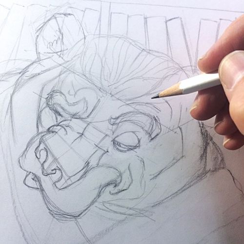
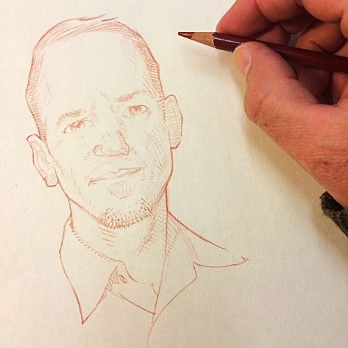
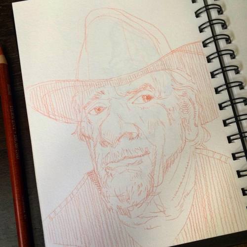
I have a friend in comics that is trying to break into painting but he can't make the leap from line drawing to tonal drawing. While he made edges during his career using hatch lines, translating those lines into tonal edges is a huge leap for him.
Edges are elusive and can be difficult to explain to someone if that person does not understand the concept. An edge is an artistic concept. An edge is a boundary between spaces and objects. An edge is a boundary between one value and another. And an edge is a boundary between one color and another. There is an edge chart that defines the four types of edges in drawing and painting that exclude texture. The edges are: sharp, firm, soft, and lost respectively in an edge gradient.
I also want to clarify the term boundary. Boundary is used to explain where one thing ends and another begins. In Western thinking, boundaries or in the case of art, lines are a division of space. However, in Eastern thinking the boundary or line is a tool to join two distinct spaces or color or values, etc. This takes some time to clearly understand and is so true. In drawing, we have to use lines to denote where on the page we intend to work on and render something. However, those lines should not be misunderstood. They are not important, what is important is that the lines help you measure the spaces you are planning out to make the rendering portion of the picture positive in its production.
Once we understand the true purpose of line in drawing, once we understand line is a construction tool in a tonal drawing, and when we can separate our brains from thinking about "just filling up the boundaries" and creating a continuous fabric of form, that is when edges really get fun to create, or rather, that's when the art of illusion making gets interesting.
Edges do not have to be difficult to do and do not always require hundreds of hours to map, fill and control. Depending upon the materials used edges can be labor intensive or instant. To discover which tools complement your rendering temperament requires lots of experimentation with no attachment and the love of "digging in and getting dirty."
I dug in to make this drawing. It is a little larger than life and was done in about 30 minutes. I used outline as a graphic design device but went to town within that outline with a variety of edges. Knowing the materials I am working with and how they function, from the paper to the charcoal pencils to the erasers, knowing how they work together inspires a mechanical approach or a painterly approach. In this case I took the drawing in the painterly direction and mashed together the edges quickly. The speed is a necessity for me since I am teaching a class, I only get brief moments between helping students to get my own drawing in. I find it important that I also do a drawing with the class so that I can separate how to build a picture to completion vs. the demonstrations that often illustrate the beginning stages of a drawing.
Edges help reinforce the illusion of dimension. Edges cannot be drawn on in just one direction either because what an edge represents is an ever changing surface of an object that expands in multiple directions at once. If the surface has the influence of bones or muscles underneath then the edges will have a more specified look to them, either more rounded or more angular in a formal geometric way but will still have a continuous surface in every direction. This continuous surface concept is where it gets tricky to describe what we are doing. I will let the videos tackle this dialog.
This hand drawing was done in about 5 minutes and represents that "all over" look of the edges and how they disperse over the surface area. Knowing what the shapes are that I am looking at makes it much easier to design the picture almost entirely of edges without much of a line drawing to start with. If I use the pencil just right, I can make the depth of the edge all in one pull.
I think the ultimate trick and goal in the arts is to make something truly from an effortless-like appearance and approach, using every rule, tool, facility and dexterity to muster up instant life from the materials we use. However, most art schools do not teach this and many of those that do do not always have the strongest academic foundation programs and the students are left to their own skill to try solve this riddle if they even know to look for it.
Here are a few videos that I hope will entertain the idea of edges and how to work with them. They are sped up to keep them within attention span time but are still easy to follow.
The pencil is both a writing and drawing implement. While writing likes to limit the pencil to an upright and tip only position, drawing allows for both. Watch the video for how I hold the different pencils I use. It is in the bending and pushing of the pencil tip that allows for all the range of sensitivity and resistance. Where you hold the pencil, up close to the pencil tip or further back towards the back end of the pencil will determine whether the line is a truly mechanical line or an organic one. The rest is a lot of hard work, and then more hard work on top of that. Enjoy the practice.