via Yesterday’s Papers http://ift.tt/2mD4zAz
By TAD HERRIMAN. That’s the monicker you see signed to the Krazy Kat drawings. His first name is George, but the boys call him Garge, because that’s the way he pronounces it himself. Now I’m not going to sit here and chuck the swell about that guy, I’m going to tell the truth. Garge came from somewhere out west, we think it’s Los Angeles. He came here on a side door Pullman

This blog is a collection of posts from my personal blog, Tumblr blog, and re-bloggings from my reading list. I hope you enjoy it!
26 March 2017
RIP Bernie Wrightson
via Gurney Journey http://ift.tt/2mibzGH

I'm sad to hear about the passing of horror illustrator and concept artist Bernie Wrightson (1948-2017). He's at the center of this picture, which also includes Pete Von Sholly (far left) and Dave Merritt at Jonas' Studios in 1993.
I'm sad to hear about the passing of horror illustrator and concept artist Bernie Wrightson (1948-2017). He's at the center of this picture, which also includes Pete Von Sholly (far left) and Dave Merritt at Jonas' Studios in 1993.
Bernie Wrightson 1948–2017
via William Stout's Journal http://ift.tt/2n5WsvB
It is with great sorrow I report the death of my friend, colleague and hero, Bernie Wrightson. Without going into Wrightson’s entire biography, please allow me to express some random bits about our relationship and why he and his work meant so much to me.
Bernie was one year older than me — which doesn’t seem like much now. A one-year difference seemed enormous in my youth, however. I followed his early fan and fanzine work (which included an formative piece of his that ran in the Creepy magazine letters section one issue), then celebrated when he finally trail-blazed into the Big League of DC comics. Bernie showed me it was possible to have that dream of being a young man and making a living drawing comics to be a distinct possibility.
Bernie will forever be linked with his impressive and groundbreaking DC Comics run of Swamp Thing (a character he co-created with writer Len Wein) and his celebrated Franklin Booth-ish Frankenstein illustrations, that brought him even more acclaim, as well as great notice from some heavy-hitting art collectors. I loved what Wrightson brought to Batman and Spiderman as well. Bernie just seemed to “get” things on every level — he recognized the “essence”. He understood that certain key elements of genres that inspired him just might inspire others, too — and he was right.
Bernie was a co-founder of The Studio, an east coast phenomenon that included Michael Kaluta, Jeffrey Jones and Barry Windsor Smith. This powerhouse of talent inspired me to help form a west coast version at my own spacious studio on La Brea Avenue that at times included Richard Hescox, Dave Stevens and Paul Chadwick.
Bernie picked up the brush-inking torch from Frank Frazetta. I looked at both of these great artists for inspiration and analyzed their remarkable technique with their weapon of choice, a Winsor-Newton brush. Frank and Bernie inspired other brush-men, including Dave Stevens, Mark Schultz and Frank Cho. I dubbed our loose group “The Last Brush-men of the Kalahari” (an artistic take on the Lost Bushmen of the Kalahari). I’m happy to report that a few up-and-coming young lads (and a couple of older guys) have since taken up the torch of brush inking, seemingly inspired by our endeavors.
If I had to describe Wrightson’s basic style at its very essence, I’d call it Frank Frazetta’s solid drawing and ability with a brush combined with the truly disturbing and demented visions of EC’s Graham Ingels. I looked at Bernie’s inking when I wanted to figure out how to depict veins on well-muscled arms. His take on dinosaurs — while not the last word in scientific accuracy — nevertheless seeded my imagination with his dramatic portrayals of these great beasts, helping me to see them anew with fresh, unblinking eyes.
I was the go-to creature designer for the movie biz until Wrightson came to town. My offers immediately shriveled and shifted (rightfully so) to Bernie. Bernie was THE master monster artist. His imagination in that arena seemed breathtakingly endless. I didn’t mind losing the work because it meant that I got to see more of Bernie’s amazing creations up on the movie screen — and I’d much rather gaze upon his fascinating creatures than my own.
Through moving in the same comic book convention circles I finally got to meet Bernie. He was as gracious in person as his art was solid and we became fast friends, especially connecting with our shared love of monsters, dinosaurs and EC comics.
I initially passed on seeing the movie The Texas Chainsaw Massacre until I read in an interview that Chainsaw was so scary it had made Bernie pee his pants. On that high recommendation I dashed to the World Theater to catch a three-movies-for-99¢ screening of this grindhouse wonder. I was not disappointed.
In 1984 the job of production designer for Return of the Living Dead came down to being between Bernie and me — with Bernie the director’s first choice. The producer gave me the gig because I had more experience in film than Bernie at the time — but I did manage to slip some Bernie-isms into some of my designs so that he might be there in spirit.
I tried to work with my pal whenever I could, but our work paths seldom crossed. When possible, we’d send each other jobs in The Biz. We mostly saw each other and hung out at conventions, though. I was delighted when he finally met the love of his life, Liz — a real sweetheart, as Al Williamson would say. Bernie’s other friends agreed with me that Liz was one of the best things that ever happened to Wrightson. I’ve watched Bernie’s talented sons grow and mature into fine young men. I feel very much like an uncle to them and share the pain of their dad’s passing.
I’ve lost a dear, dear friend — but the world at large has lost a truly great artist. Though his mortal form has passed into the land beyond beyond, his magnificent body of work will live on forever.
Draw Without Borders
via Muddy Colors http://ift.tt/2n5YT4N

-By Arnie Fenner
Above: The principals of the original Illustrators Workshop. Left to right: Robert Heindel, Fred Otnes, Robert Peak, Alan E. Cober, Bernie Fuchs, and Mark English.
"Giving back" has always been a generous aspect of the art community. Knowing the struggle to make and maintain a career (or to simply improve skills and craft), artists routinely share their expertise with others to help them in the pursuit of their goals. Sometimes there's a cost (as for a class or workshop), sometimes not (as at a convention), but the value of what professional artists and illustrators give is significantly greater than any charge there might be for the knowledge offered.
Recognizing that formal art schools often only take students so far, Mark English joined with a group of the country's star artists in the late 1970s to form The Illustrators Workshop. Its impact was immediate and immense and the good it did influenced others to create similar educational experiences over the years.

The Illustrators Workshop eventually transitioned into The Illustration Academy under the guidance of Mark's son John and, though there have been ups and downs, their mission to help artists achieve sustainable careers has continued unabated. With instructors like C.F. Payne, Karla Ortiz, Victo Ngai, Jon Foster, and Mark himself, TIA offers a nurturing environment that helps bring the best out of its students.
Now they've launched an exciting new charitable arts program for women artists outside of the United States. Here's their idea:
"We recently invited a young Iraqi woman named Nahrain to attend one of our online workshops. Only hours from a war zone, in an environment barren of art education, this individual strives to advance her abilities as a comic book artist. Despite societal, institutional, and frankly criminal barriers, she was still able to connect and learn from professional illustrators through our online platform. This moment embodied the profound and empowering ingenuity online education can unlock. It reminded us how interconnected our world has become and yet how unbalanced our liberties remain.
"As a small organization, we are fortunate to be part of an international community of profoundly talented artists. We are hoping that you can help us deliver art education to aspiring women artists from regions of the world that discourage or prohibit the progress of women in the visual arts. We believe this is a global issue, but we hope to focus our mission on regions and communities that are in critical need.
"We firmly believe everyone deserves the right to pursue their dreams. We are in a unique situation where we have the ability to empower individuals who have been stripped of that right. We are calling this project Draw Without Borders."


The Illustration Academy's plan is to offer free online instruction to artists living in Afghanistan, Syria, Iraq, Yemen, Jordan, Iran and Turkey. Uninterrupted internet access might be a challenge overseas, but who wouldn't want free instruction from Gary Kelley or George Pratt? The arts can be as controversial and divisive a topic as any these days, but it can also build bridges and promote understanding and compassion. The arts can open doors for communication that politics often close and bolt.
I've lectured at the school; I've poked my head in during various summer workshops and have always come away amazed by the passion of the students and instructors alike. "Draw Without Borders" is an extension of what the Illustration Academy has always tried to do and a sincere effort to offer something positive to those without.
You can hit this link to the the Academy's website to learn more.
Recognizing that formal art schools often only take students so far, Mark English joined with a group of the country's star artists in the late 1970s to form The Illustrators Workshop. Its impact was immediate and immense and the good it did influenced others to create similar educational experiences over the years.
Now they've launched an exciting new charitable arts program for women artists outside of the United States. Here's their idea:
"We recently invited a young Iraqi woman named Nahrain to attend one of our online workshops. Only hours from a war zone, in an environment barren of art education, this individual strives to advance her abilities as a comic book artist. Despite societal, institutional, and frankly criminal barriers, she was still able to connect and learn from professional illustrators through our online platform. This moment embodied the profound and empowering ingenuity online education can unlock. It reminded us how interconnected our world has become and yet how unbalanced our liberties remain.
"As a small organization, we are fortunate to be part of an international community of profoundly talented artists. We are hoping that you can help us deliver art education to aspiring women artists from regions of the world that discourage or prohibit the progress of women in the visual arts. We believe this is a global issue, but we hope to focus our mission on regions and communities that are in critical need.
"We firmly believe everyone deserves the right to pursue their dreams. We are in a unique situation where we have the ability to empower individuals who have been stripped of that right. We are calling this project Draw Without Borders."
Top: John English. Bottom: TIA instructor Gary Kelley.
The Illustration Academy's plan is to offer free online instruction to artists living in Afghanistan, Syria, Iraq, Yemen, Jordan, Iran and Turkey. Uninterrupted internet access might be a challenge overseas, but who wouldn't want free instruction from Gary Kelley or George Pratt? The arts can be as controversial and divisive a topic as any these days, but it can also build bridges and promote understanding and compassion. The arts can open doors for communication that politics often close and bolt.
I've lectured at the school; I've poked my head in during various summer workshops and have always come away amazed by the passion of the students and instructors alike. "Draw Without Borders" is an extension of what the Illustration Academy has always tried to do and a sincere effort to offer something positive to those without.
You can hit this link to the the Academy's website to learn more.
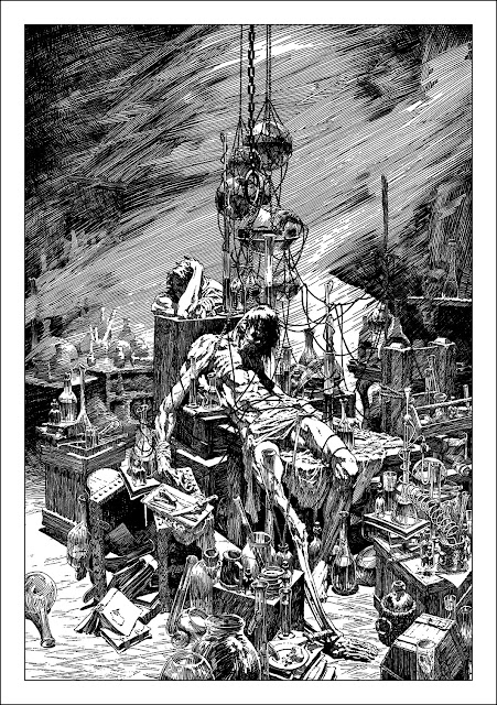
Bernie Wrightson's Frankenstein
via Muddy Colors http://ift.tt/2nqmttZ
Sadly, Bernie Wrightson passed away this weekend due to brain cancer. There are many people more suited to describing what an astounding man we was than I. But suffice it to say, he was incredibly influential to an entire generation of comic book artists and illustrators alike. He will be sorely missed.
I thought it would be a nice time to reflect on some of his work. Here are some stellar examples from his masterpiece, 'Frankenstein'.
Bernie Wrightson
via Lines and Colors :: a blog about drawing, painting, illustration, comics, concept art and other visual arts http://ift.tt/2mm40Pl


Bernie (Berni) Wrigntson was an American comics artist and illustrator known for his work on horror comics for DC Comics and Warren Publishing, on titles like Batman and, in particular, Swamp Thing.
Bernie Writghtson died on Saturday at the age of 68.
His work on Swamp Thing set new standards for horror comics art and was influential on other artists. Wrightson eventually left DC for Warren Publications, which was publishing black and white horror comics Creepy and Eerie that were printed larger than typical comic books, at magazine size.
Wrightson was a major figure in American comic book art, and at one point joined together with Jeffrey (Catherine) Jones, Barry Windsor-Smith and Michael Kaluta — like-minded artists who took inspiration from the great Golden Age illustrators — to share a joint space in New York called “The Studio”.
Wrightson was inspired by 1950’s horror comics from EC, and in particular the work of Graham Ingles and Frank Frazetta, but later in his career the influence of great pen and ink illustrators become more prominent, particularly the fantastic work of Franklin Booth. Those influences became evident in Wrightson’s acknowledged masterpiece, a series of elaborate and beautifully realized illustrations for Mary Shelly’s classic Frankenstein (images above, top two, with details).
This was not an assignment, Wrightson took on the project in his spare time out of love for the material. The illustrations were initially released as a limited edition portfolio. (A personal note: when I got divorced many many years ago, my ex-wife and I didn’t have any children or a house to argue over, but we wound up splitting joint custody, half and half, of the Frankenstein portfolio).
The drawings were later used in new editions of the Mary Shelly novel published accompanied by Wrightson’s illustrations.
Unfortunately, as far as I know, the book versions are out of print. Dark Horse still has a listing for their digital version, also for their collections of work from Creepy and Eerie that include some of Wrightson’s work. The print editions of Frankenstein may still be available used, though prices are likely to go up.
Wrightson and writer Steve Niles later followed with a comic book adaptation, Frankenstein Alive Alive! (images above, middle) which was published by IDW.
You may be able to find other Wrightson materials through used book sources, including reprints of some of his classic Swamp Thing issues.
The best currently in print source for his comics work is probably Creepy Presents Bernie Wrightson, a compendium of some of his work for Warren publishing, meant from the outset to be viewed in black and white, which is how I think his work is at its best.
Unfortunately, I don’t know of a good major online resource for viewing Wrightson’s work.
There is an official Bernie Wrightson website, with a bio and image galleries, unfortunately, the images in the galleries are maddeningly small and not well reproduced for the web, though they can still give you an overview of the range of Wrightson’s work.
There are a few original art pages still for sale directly from the family (as of this writing) through Comic Art Fans, as well as some from other sellers.
Otherwise, I’ll point to some obits and tribute pages that feature some examples of his art. You can also simply try a Google image search.
Included in my row of example images above, bottom, is a little gem from my own collection — a Bernie Wrightson convention sketch gifted to me by Galactic Geographic artist Karl Kofoed.
A List of Tools to Achieve a Stronger Likeness
via Muddy Colors http://ift.tt/2mBvPUa
I’m tackling a challenging task with a current project that is fun and frustrating at the same time. I have to draw consistent likenesses with several individuals and make up expressions that I have not seen them perform. It is one of those challenges that can sometimes makes me want to take up accounting or stamping out Cheerio’s for a living. The task is hard enough as it is with a single image, add to it several dozen other frames and the gray hairs multiply quickly.
like theater, the expressions/acting should exaggerate the gesture or emotion, or heighten it so everyone in the audience can experience the moment, not just the first few rows. This means that the actor should know a great deal about what it means to idealize each emotion and as well, learn to turn the dial of subtlety and create an entire gradient of emotions with equal conviction. Idealizing, or clarifying the gesture, the expression, or the action, is essential for the story to be told with the greatest assurance of clarity in mind. The reality is that more than likely you will not have reference for every specific story beat and you will have to make them up and still capture the likeness.
But to express extremes and/or very well designed subtlety, the likeness of the individual must be well controlled. This means that before beginning any illustration it is a good idea to warm up with the subject until the subject could theoretically be drawn without the reference.
I have tried to break down the process of generating a likeness by separating most of the key components into a design language. When we draw, we are using the combination of these tools plus drawing experience and all the subtle nuances of that, and knowledge of anatomy.
I am using one of my subjects for a project I am currently working on. His name is Chris Roberts and he is a host for a Skateboarding Podcast called The Nine Club Show. If you like skating its worth listening to, long overdue. Anyway, here are the two reference points I am working from along with all the video footage from the Podcast hidden behind his mic. The Profile ref is a frame grab from one of the few moments he is filmed in profile so it was great that I actually found this. Notice that in many front views you might miss the change in planes between the cheek bones and the muzzle and the pentagonal design with the mustache and beard shapes on his face. This is exactly why it is important to hunt down solid reference especially when the job calls for a likeness of a celebrity or public figure.


Here is a brief list of items to consider when attempting to capture a likeness and some ideas about how they might change when changing expressions.
1. Contour – Contour is not a cardboard cut-out. It is very complex and waivers between forward facing shapes and the back of the object. Related to the human head, above the cheek bones the contour is broken up into a few zones; the top of the skull contour is the middle of the skulls mass and the sides are really the back portion of the skull. Below the cheek bones the contour is the back of the jaw, and towards the chin that contour is the front of the skull. (Brain burst moment)

2. Features – One of the more important aspect of capturing a likeness is getting the distance between the features accurate. The starting point to establish this distance is the keystone shape between the eyebrows called the Glabella. The pitch on both sides of this inverted triangle are measured from the sloping angle of both eyebrows. The distance between the brows and the angle of both brows helps the artist triangulate this feature.
All the other features are triangulated back to the centerline and keyed off of the distance between the eyes. Most of us do not have perfectly symmetrical features so remember that when you are establishing the triangulation between the reference points that the only fixed point will be the one on the centerline, the other two points will more than likely vary in elevation and distance from each other and the centerline.

3. Orthographic relationship between the front view and the side view – It would be fantastic to have video footage of the individual but if you are doing a graphic sequence of Abraham Lincoln that could be a bit tricky. However, if you can find reference for both a pretty solid front view and a pretty solid profile view then you are in great shape.
Lines on the face divide volumes from one another, natural lines are plane breaks from the skeletal and muscular/fatty masses under the skin. Lines from age express similar mass divisions on the face and occur perpendicular to muscle forms. Where these lines occur are usually divisions for forward protruding masses, or sideways protruding masses. Along with the line break there should also be a value change of some sort. A hint, if the light source is powerful enough to diminish this subtle lighting of form chance, especially on a forward-facing portrait, the other indicator is temperature change, which is a fancy way of saying color change.

4. Gesture – Sometimes doing all the math will still capture something less like the person, less correct in the “feeling”. A person is living, a photo is a snapshot in time. That snapshot captured them mid breath, inhaling or exhaling and everything changes on us in very subtle ways. Was the photo shot when the person was happy, angry, depressed? Etc. We have to be very careful in how we choose that reference and take many of these aspects into consideration when launching from that reference point. Sometimes that quick gestural line that was barely thought over when executed can be that mark that makes everything “just right” in capturing not just a likeness, but the personality of the individual so many might know so well.
I also feel it is important to know how to cartoon or line gesture as much as sight measure or whatever other academic tools the artist trains to use. Without this skill I feel that another aspect of likeness, caricature, will not translate very well and the likeness can easily border line on not really looking quite like the individual or have a measured out look to it rather than it "feeling" right in its effortlessness. These are short gesture sketches, each about 3 minutes each attempting to exaggerate the shape language and become familiar with the design of his portrait.

5. Value – Value=Form and form is the other likeness factor. Value sets up color for when that is applied so value is complexion and dimension simultaneously. This is where multiple views will be very helpful to deduce the images that you are copying from. Looking for the color and light changes will be important. What you see on one side of the head will be similar on the other side of the head but do not assume they will be perfect

6. Shapes – Abstraction is seeing beyond the norm and looking for other attributes that help solve the drawing problems we encounter when copying something. Shape is an abstract concept. We look beyond the details and sum up the space we think we are perceiving and we use that geometric design as another tool to help capture the essence of the subject.

7. Drawing experience – without an understanding of how to control lines and tones, many of the tools above will be difficult to control and maintain consistently from one drawing to the next. Learning to control line weight, pressure, edge, shape, etc. is another essential tool in helping to make capturing a likeness less difficult to accomplish.
8. Anatomy and understanding plane breaks – in addition to drawing experience, training in anatomy is also important to help facilitate the drawing experience with reference points to achieve using the above tools. This is not as difficult as it may sound but it does require a game plan to build on or it can spin out of control rather quickly.

This was roughly 30 minutes using a Blackwing Soft pencil and 11 x 17" xerox paper, cheap but effective. When I am sketching to learn I do not hold dearly to any of the drawings, they are all subject to abuse and radical change. When I get nice paper I feel guilty when I have to butcher up a drawing to correct it, and I feel like I should not have made a major mistake on such important and expensive paper, which in the end is a goofy way to think. It takes sacrifice to learn the tools of our trade.
When learning representational art, likeness is important. To capture what you draw as accurately as possible is the only way to have an honest objective dialog between student and instructor, and is a solid way to judge that your eyes and hands are developing in your craft. Likeness is also an important measure of how far along you are with your training and how much further you want to or should develop before looking to become a professional. And to the professional a likeness is important so you know how to start from there then tweak as needed and still capture the essence of who it is that you are crafting up.
As soon as I get finished with this job I will get back to those color portraits. Practice as much as you can between jobs or just whenever you can. Have a goal when you practice so you can gauge whether you have accomplished more than just the act of drawing or painting, and Happy Arting.
-By Ron Lemen
I’m tackling a challenging task with a current project that is fun and frustrating at the same time. I have to draw consistent likenesses with several individuals and make up expressions that I have not seen them perform. It is one of those challenges that can sometimes makes me want to take up accounting or stamping out Cheerio’s for a living. The task is hard enough as it is with a single image, add to it several dozen other frames and the gray hairs multiply quickly.
like theater, the expressions/acting should exaggerate the gesture or emotion, or heighten it so everyone in the audience can experience the moment, not just the first few rows. This means that the actor should know a great deal about what it means to idealize each emotion and as well, learn to turn the dial of subtlety and create an entire gradient of emotions with equal conviction. Idealizing, or clarifying the gesture, the expression, or the action, is essential for the story to be told with the greatest assurance of clarity in mind. The reality is that more than likely you will not have reference for every specific story beat and you will have to make them up and still capture the likeness.
But to express extremes and/or very well designed subtlety, the likeness of the individual must be well controlled. This means that before beginning any illustration it is a good idea to warm up with the subject until the subject could theoretically be drawn without the reference.
I have tried to break down the process of generating a likeness by separating most of the key components into a design language. When we draw, we are using the combination of these tools plus drawing experience and all the subtle nuances of that, and knowledge of anatomy.
I am using one of my subjects for a project I am currently working on. His name is Chris Roberts and he is a host for a Skateboarding Podcast called The Nine Club Show. If you like skating its worth listening to, long overdue. Anyway, here are the two reference points I am working from along with all the video footage from the Podcast hidden behind his mic. The Profile ref is a frame grab from one of the few moments he is filmed in profile so it was great that I actually found this. Notice that in many front views you might miss the change in planes between the cheek bones and the muzzle and the pentagonal design with the mustache and beard shapes on his face. This is exactly why it is important to hunt down solid reference especially when the job calls for a likeness of a celebrity or public figure.
Here is a brief list of items to consider when attempting to capture a likeness and some ideas about how they might change when changing expressions.
1. Contour – Contour is not a cardboard cut-out. It is very complex and waivers between forward facing shapes and the back of the object. Related to the human head, above the cheek bones the contour is broken up into a few zones; the top of the skull contour is the middle of the skulls mass and the sides are really the back portion of the skull. Below the cheek bones the contour is the back of the jaw, and towards the chin that contour is the front of the skull. (Brain burst moment)
2. Features – One of the more important aspect of capturing a likeness is getting the distance between the features accurate. The starting point to establish this distance is the keystone shape between the eyebrows called the Glabella. The pitch on both sides of this inverted triangle are measured from the sloping angle of both eyebrows. The distance between the brows and the angle of both brows helps the artist triangulate this feature.
All the other features are triangulated back to the centerline and keyed off of the distance between the eyes. Most of us do not have perfectly symmetrical features so remember that when you are establishing the triangulation between the reference points that the only fixed point will be the one on the centerline, the other two points will more than likely vary in elevation and distance from each other and the centerline.
3. Orthographic relationship between the front view and the side view – It would be fantastic to have video footage of the individual but if you are doing a graphic sequence of Abraham Lincoln that could be a bit tricky. However, if you can find reference for both a pretty solid front view and a pretty solid profile view then you are in great shape.
Lines on the face divide volumes from one another, natural lines are plane breaks from the skeletal and muscular/fatty masses under the skin. Lines from age express similar mass divisions on the face and occur perpendicular to muscle forms. Where these lines occur are usually divisions for forward protruding masses, or sideways protruding masses. Along with the line break there should also be a value change of some sort. A hint, if the light source is powerful enough to diminish this subtle lighting of form chance, especially on a forward-facing portrait, the other indicator is temperature change, which is a fancy way of saying color change.
4. Gesture – Sometimes doing all the math will still capture something less like the person, less correct in the “feeling”. A person is living, a photo is a snapshot in time. That snapshot captured them mid breath, inhaling or exhaling and everything changes on us in very subtle ways. Was the photo shot when the person was happy, angry, depressed? Etc. We have to be very careful in how we choose that reference and take many of these aspects into consideration when launching from that reference point. Sometimes that quick gestural line that was barely thought over when executed can be that mark that makes everything “just right” in capturing not just a likeness, but the personality of the individual so many might know so well.
I also feel it is important to know how to cartoon or line gesture as much as sight measure or whatever other academic tools the artist trains to use. Without this skill I feel that another aspect of likeness, caricature, will not translate very well and the likeness can easily border line on not really looking quite like the individual or have a measured out look to it rather than it "feeling" right in its effortlessness. These are short gesture sketches, each about 3 minutes each attempting to exaggerate the shape language and become familiar with the design of his portrait.
5. Value – Value=Form and form is the other likeness factor. Value sets up color for when that is applied so value is complexion and dimension simultaneously. This is where multiple views will be very helpful to deduce the images that you are copying from. Looking for the color and light changes will be important. What you see on one side of the head will be similar on the other side of the head but do not assume they will be perfect
6. Shapes – Abstraction is seeing beyond the norm and looking for other attributes that help solve the drawing problems we encounter when copying something. Shape is an abstract concept. We look beyond the details and sum up the space we think we are perceiving and we use that geometric design as another tool to help capture the essence of the subject.
7. Drawing experience – without an understanding of how to control lines and tones, many of the tools above will be difficult to control and maintain consistently from one drawing to the next. Learning to control line weight, pressure, edge, shape, etc. is another essential tool in helping to make capturing a likeness less difficult to accomplish.
8. Anatomy and understanding plane breaks – in addition to drawing experience, training in anatomy is also important to help facilitate the drawing experience with reference points to achieve using the above tools. This is not as difficult as it may sound but it does require a game plan to build on or it can spin out of control rather quickly.
This was roughly 30 minutes using a Blackwing Soft pencil and 11 x 17" xerox paper, cheap but effective. When I am sketching to learn I do not hold dearly to any of the drawings, they are all subject to abuse and radical change. When I get nice paper I feel guilty when I have to butcher up a drawing to correct it, and I feel like I should not have made a major mistake on such important and expensive paper, which in the end is a goofy way to think. It takes sacrifice to learn the tools of our trade.
When learning representational art, likeness is important. To capture what you draw as accurately as possible is the only way to have an honest objective dialog between student and instructor, and is a solid way to judge that your eyes and hands are developing in your craft. Likeness is also an important measure of how far along you are with your training and how much further you want to or should develop before looking to become a professional. And to the professional a likeness is important so you know how to start from there then tweak as needed and still capture the essence of who it is that you are crafting up.
As soon as I get finished with this job I will get back to those color portraits. Practice as much as you can between jobs or just whenever you can. Have a goal when you practice so you can gauge whether you have accomplished more than just the act of drawing or painting, and Happy Arting.
Love the Mullet: Working on Grafix Dura-lar
via Muddy Colors http://ift.tt/2mUG1lH

'Business in the front and party in the back.' Dura-lar, aka, the Mullet of painting surfaces.
I first stepped into working on Dura-lar on a journey for the above. I wanted a surface that I could do detail work on the front side, but also be able to cut loose, get aggressive with my mark making on the reverse, and NOT mess up all the hard work I'd already done.
I tried vellum, or the modern version of vellum that comes in a pad (like a thick tracing paper). But it wrinkled when wet. Which can have some cool effects, but not what I was after. I do Yupo once in a while, but almost all the work has to happen on the front, because it isn't nearly as translucent.
Then I discovered the Grafix Dura-lar. It does not wrinkle no matter how wet you get it. And it has taken everything I have thrown at it from graphite to oil paint, like a champ.
 The first thing to know is I use the MATTE version. Not the 'wet media' version. The matte will take dry media (Prisma, graphite, charcoal, pastel.) and wet media (Acrylic ink, acrylagouache, enamel, oil paint).
Because the matte is translucent, and not clear, it will ghost out what ever work is done on the reverse. I love this aspect because it is automatic atmospheric perspective, and lets you judge your final, darkest accents on the front.
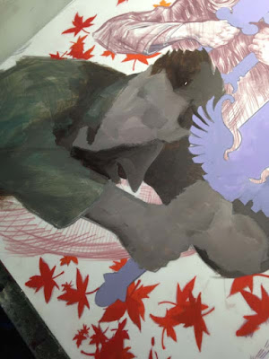
What follows is a step by step of my Angel and Faith cover #19 for Dark Horse Comics. I am using Prisma Color pencil FW ink and Acrylagouache:
This is the level I took my digital comp before even beginning to make it real. I like to have most of the design questions answered, which frees me in the application of materials, because I can have fun with such a solid foundation beneath me.

The rough drawing is printed out and is now on my light box with the Dura-lar over the print. I have selected pencils within in a limited range of values.

Time to DRAW! I did most of the first character with one prisma pencil. Note how FLAT prisma color goes down on duralar. It is almost like gouache!

I work my way through the second character in darker Prisma values than the first. I am basically working in color zones through out the piece.

Having finished the characters, I move on to the swords and the falling leaves.


For the third character I wanted a softer feel, so I used the side of the pencil for shading.

And here we have the drawing on dura-lar with a piece of white paper behind it. Any values you saw prior to this were the original print-out of my rough drawing.

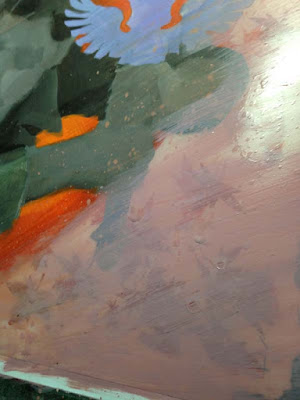
I flip the drawing over and start working the back side. I mix a quick gradient of Acrylagouache on my pallet, and start filling in the transition of the leaves.

And when we flip it back over to the front, you can see the line-work over the leaves. Some ask, "Why not just do it all on the front?" And the reason is, it would be much harder to draw with colored pencil on top of lumpy paint. And I want the lines to show, for as I get older I realize the true heart of an artist is in the drawing. (No matter how you frost it.)

Filling in the swords on the back, and the flip reveal.


The below sequence shows the puddle of value I mix for Angel, and the ham fisted 'render' I do on the back side of figures. So there will be some transition in the flat, some base structure, but the detail is all on the front.


Same thing for Faith, filling in her form on the reverse with a painted gradient and crude modeling.


Ahh... but the magic is in the FLIP! The drawing is doing all the work!

With my dark and middle values established, it is time to work up the highlights! Again using a range of three lighter value prisma pencils.


And here is the entire scene with the major elements drawn on front and painted on back. Now it is time to have fun!

This is where the really aggressive things happen. Spatter, streaks, scratches it is all fair game because I know the major details of the piece will be pristine on the front.


Flipping back over for more fun. You often have to paint in reverse, like an animation cel painter or a glass painter. Protecting things like figures with flat paint before you start up the party wagon of texture.


And the final flip! Sometimes I will cover the entire back with white after it is done.

Hope you enjoyed it!
'Business in the front and party in the back.' Dura-lar, aka, the Mullet of painting surfaces.
I first stepped into working on Dura-lar on a journey for the above. I wanted a surface that I could do detail work on the front side, but also be able to cut loose, get aggressive with my mark making on the reverse, and NOT mess up all the hard work I'd already done.
I tried vellum, or the modern version of vellum that comes in a pad (like a thick tracing paper). But it wrinkled when wet. Which can have some cool effects, but not what I was after. I do Yupo once in a while, but almost all the work has to happen on the front, because it isn't nearly as translucent.
Then I discovered the Grafix Dura-lar. It does not wrinkle no matter how wet you get it. And it has taken everything I have thrown at it from graphite to oil paint, like a champ.
Because the matte is translucent, and not clear, it will ghost out what ever work is done on the reverse. I love this aspect because it is automatic atmospheric perspective, and lets you judge your final, darkest accents on the front.
What follows is a step by step of my Angel and Faith cover #19 for Dark Horse Comics. I am using Prisma Color pencil FW ink and Acrylagouache:
This is the level I took my digital comp before even beginning to make it real. I like to have most of the design questions answered, which frees me in the application of materials, because I can have fun with such a solid foundation beneath me.
The rough drawing is printed out and is now on my light box with the Dura-lar over the print. I have selected pencils within in a limited range of values.
Time to DRAW! I did most of the first character with one prisma pencil. Note how FLAT prisma color goes down on duralar. It is almost like gouache!
I work my way through the second character in darker Prisma values than the first. I am basically working in color zones through out the piece.
Having finished the characters, I move on to the swords and the falling leaves.
Detail shots.
For the third character I wanted a softer feel, so I used the side of the pencil for shading.
And here we have the drawing on dura-lar with a piece of white paper behind it. Any values you saw prior to this were the original print-out of my rough drawing.
I flip the drawing over and start working the back side. I mix a quick gradient of Acrylagouache on my pallet, and start filling in the transition of the leaves.
And when we flip it back over to the front, you can see the line-work over the leaves. Some ask, "Why not just do it all on the front?" And the reason is, it would be much harder to draw with colored pencil on top of lumpy paint. And I want the lines to show, for as I get older I realize the true heart of an artist is in the drawing. (No matter how you frost it.)
Filling in the swords on the back, and the flip reveal.
The below sequence shows the puddle of value I mix for Angel, and the ham fisted 'render' I do on the back side of figures. So there will be some transition in the flat, some base structure, but the detail is all on the front.
Same thing for Faith, filling in her form on the reverse with a painted gradient and crude modeling.
Ahh... but the magic is in the FLIP! The drawing is doing all the work!
With my dark and middle values established, it is time to work up the highlights! Again using a range of three lighter value prisma pencils.
And here is the entire scene with the major elements drawn on front and painted on back. Now it is time to have fun!
This is where the really aggressive things happen. Spatter, streaks, scratches it is all fair game because I know the major details of the piece will be pristine on the front.
Flipping back over for more fun. You often have to paint in reverse, like an animation cel painter or a glass painter. Protecting things like figures with flat paint before you start up the party wagon of texture.
And the final flip! Sometimes I will cover the entire back with white after it is done.
Hope you enjoyed it!
Subscribe to:
Posts (Atom)