17 December 2010

Light During the Darkest Days

The Chieu Hoi Saloon is ready to hit the shelves.The Chieu Hoi Saloon, ready to hit the shelves

In this blog post I get giddy about a second illustration going to print, and then get very prosaic about life, illustration and the nature of things coming to pass.

Currently my primary blog is through my website, so if you'd like to update your RSS feed to go there, this is the URL: http://studiobowesart.com/feed/

Best Wishes,
Brian Bowes

06 November 2010

Society of Illustrators #53 Submissions

Brian Bowes Jetcycle Getaway

Well, wish me luck, the images have been submitted and the bill has been paid! Now it's all up to the judges at this year's Society of Illustrators annual show/ contest to vote on this year's winners and participants in the 53rd Illustration Annual.

For my submissions, I had to balance the cost and the number of images that I could afford to submit. I felt that 4 of the images that were created over the last year would be a nice representation. Of course I wanted to submit the piece that I did for the IMC, that was such a formative experience that I wanted to show the final piece. Also, in keeping with the Steampunk vibe, I entered my cover illustration for Steampunk Magazine #6.

Brian Bowes Steampunk Magazine Cover issue number 6

Next up for submission and in a different genre, is the wraparound cover completed for PM Press' Noir Anthology;"Send My Love and A Molotov Cocktail." I submitted this one because of the over all feeling of the image, and because it is a little more concept and a little less figurative work, and besides all that, I just like it.

Brian Bowes Love and a Molotov Cocktail wraparound cover

And finally, the piece that I have been working on for the past month or so, and that was alluded to in an earlier post, "A Curious Introduction!"

Brian Bowes Lending A Helping Hand self promo piece

Watch for an upcoming process post about the creation of not only this image, but of the whole promotional piece that this is a part of, and of the considerations behind the core concept. But for now, these are my four entries, and I feel that they do represent where I've been and where I am at. Of course I live in hope that maybe one or more of these images might be chosen to be amongst the prestigious pages of the Society of Illustrators Illustration Annual #53! Only time will tell.

Links to other blog posts:

Click here to read more about the "Jetcycle Getaway," and part of my IMC experience.

Click here to read about the creation of Ol' No.6.

14 October 2010

October Surprise: the Sneak Peak


Who's been reading James Gurney's book?

Well, things have been quite here on the blog... too quite, but, that doesn't mean that I haven't been busy! Actually I've been working up a couple different images. One image is for a charity auction later in the month, and the other is an all out effort to make a promotional piece for Halloween. Which is, oh, right around the corner!

I don't want to give too much away, but I am pretty excited about this whole promo. I am putting together a short story, and I mean very short story for the card. There will be a sum of 3 images through out, one will be brought to a finer level of finish,and one will be sort of sketchy, and the third, will be as nice as time will allow. So far things are going well image wise. I am feeling that 'deadline' pressure to make sure that this thing is well thought out, well designed, and delivered on time.

As these projects have been rolling along, I've found that I enjoy taking pictures of my drawing table. Don't ask why, but it just kinda cracks me up to see it. No particular reason.


what it looks like trying to create beauty out of squallor


However, for those who like to snoop, many of my secrets are laid bare on the table there. Jeez, it really is a mess isn't it. Oh well, works for me!

Finally, the promised sneak peak. I came up with this little, or not so little guy as the the case may be, by looking through a Dover copyright free image book of animals. The insect page just seemed to be the right fit for this piece.


Bug Eyed Monster?! more like Bug Eyed Beatnik!


So, I wanted to share a bit of what I was up to in this quick post. Watch for more news as this promo comes up to a finish here in the near future. Now, that I see this fella, with his handle-bar mustachio, he really should have a name... what do you think? Any suggestions?

As ever, thanks for reading along, your comments are always welcome, please go to the regular website and leave them there: (Studio Bowes Art | October Surprise )

Best Wishes,
Brian

14 August 2010

A Time For Love

BrianBowes_LovebirdsThank you to everyone who keeps checking back in with the blog. I have to admit that this last month or so has been quite busy. I am happy to say that some of that 'busy' has been creating new works, that will be appearing here on the site soon enough. Oh look here's one now!

The Lovebirds are a response to the the recent overturning of Propostion 8 here in California. (There's a news article, if you'd like to read more, at the end of this post.*) I am happy to see that all marriages will be recognized by my state. I was actually quite surprised when Prop 8 passed back in 2008. I guess that at least as a state, if not as a country, that we'd gotten past all this 'separate but equal' crap. This is the 21st Century after all!

I chose the Lovebirds intentionally. After looking into it a bit, I found out that Lovebirds are a bit difficult to breed because it is hard to tell the male and the female apart. Along with that factoid, I was initially drawn to their almost rainbow coloring. If you are unaware, often times Gay Culture will stand behind a rainbow flag. I think that the metaphor is obvious; all the colors of the rainbow representing all types of people. The text at the bottom reads, "Lovebirds Sing Freely," meaning in part that Love's sweet song is free to us all regardless. I think that's is apart of the best of humanity, the ability to love and love freely.

This piece is a more editorial type of piece than I've been doing in the past. I am putting in an effort to broaden my horizons and to develop a quicker process in hopes of courting some publishing work for not only online sources, but also the traditional sources like newspapers and magazines. So, look for more pieces like this in the near future.

This push towards an editorial style dove tails nicely with the recent 4 Week Challenge** over at Zero2Illo.com. I really enjoyed the 12 Week Challenge, but was unable to finish it, sad to say. In part I fell off the trail at 'build a website' week, along with the pending trips at that time to the IMC followed by ICON. As the saying goes, "Fall down 7 times, get up 8." This is me, picking things back up again, moving forward the best I can.
I really enjoy recieving feed back on the work, the writing, and the messages, so please feel free to drop me a line, or to leave a comment on the blog.

Best Wishes,
Brian
{p.s. If you haven't already, please mosey on over to the blog's new home on www.StudioBowesArt.com I will refresh this blog for a while, but eventually everything is going to move onto my website. So please, follow the link on over and adjust your blog readers accordingly. Thank you!}

*San Francisco Chronicle Article

**The 4 Week Challenge

25 June 2010

IMC 2010: initial impressions

"What have I gotten myself into now!"

"Humble" would be the word that can summarize my feelings about attending this year's Illustration Master Class. Never in my life have I been surrounded by so many incredibly talented and wonderfully supportive people. My plan is to revisit many of the ideas and experiences from this trip through different blog posts. I thought I would just start with an over view of the whole experience first.

The Illustration Master Class is a week long intensive workshop focusing on Fantasy and Science Fiction Illustration. Rebbecca Guay is one of the central organizers ( if not "the" central organizer, ) and she is supported by a faculty that reads like a "who's who" of Fantasy/ Sci Fi Illustration; Donato Giancola, Scott Fischer, Gregory Manchess, Dan Dos Santos, Julie Bell, Boris Vallejo, and Art Director Irene Gallo. This year's special guests were none other than James Gurney of Dinotopia and the Gurney Journey, and Art Director for Magic the Gathering, Jeremy Jarvis. If you don't already know these folks and have an interest in the this field of Illustration, I would HIGHLY recommend searching these folks out online.

The outline for the week went something like; arrive on Friday, meet the faculty and thumbnail/ sketch critique on Saturday, followed by a healthy dose of "Get the F to Work" on Sunday through Thursday, ending with a clean-up and open studio on Friday. Each day was punctuated by 2 talks given by one or two members of the faculty. These were great moments to open up my mind and just soak in the incredible talent and intelligence of the presenters. During the studio hours, the faculty would circulate between the 85 participants and encourage, guide, suggest, and paint with them.

My personal journey here started 2 days prior to the IMC, with a plane flight into La Guardia airport in New York. I was up all night the night before preparing everything that I could think to bring with me, maybe I brought too much, but I remembered my portfolio...at 3AM! Sheesh! In a focused hurry I printed out 7 new prints, and whammo, there's a new portfolio. I believe it represents the best of my work as it is now. It was kinda fun actually. I slept mostly on the flight, connected in Philly, on time to LGA in a little puddle jumper. I brought my drawing board ( the standard one, 24x26" ) on the planes. On the first flight it was in the overhead compartment, on the second flight it fit in plane's closet. To circumvent any hassle from the airlines, I played the neurotic-artist card, which seemed to work.

The evening that I arrived I crashed at my sister in law's house in Queens, where I found out that New Yorkers, unlike San Franciscans, like to eat tacos rather than burritos... which is just weird. The next day I had arranged to meet with Dorian Iten at the bus station to ride up together. We met at the depot and prepared for the 4 hour bus ride. Most of our time was spent looking at Dorian's portfolio from the past 2 or 3 years in Florence where he'd been studying. I don't mind saying that already I was feeling quite small! We made it to Amherst College around 3pm and signed up for one of two groups. I accidentally signed up for the group that was headed by Donato, Dan, Boris, and Julie. What I had meant to sign up for was the group which had Jeremy Jarvis, Rebbecca, and James Gurney in it, as they worked in water-media to one extent or another. It was like choosing between 'brilliant' and 'awesome!'

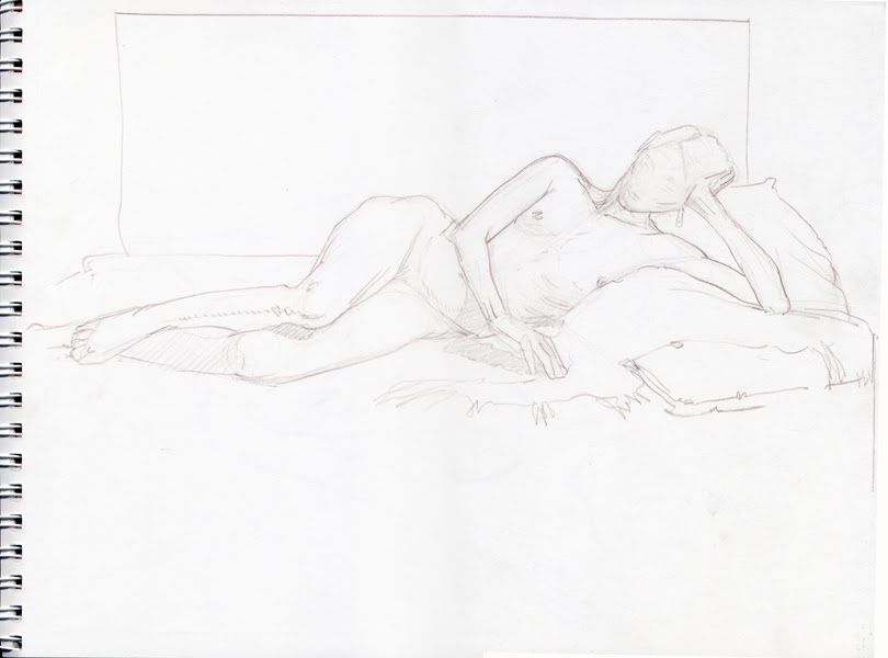
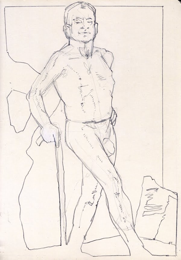
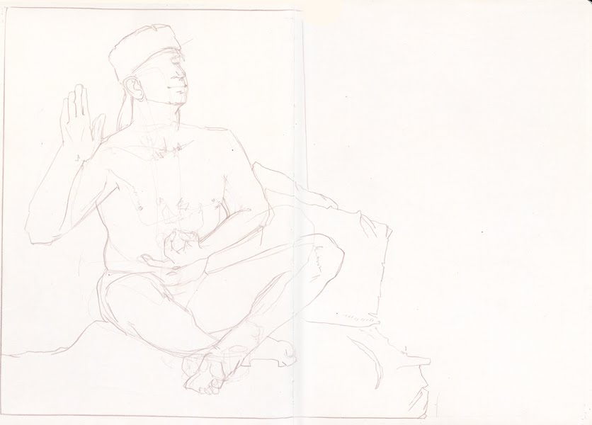
That first night was spent meeting people and sharing work. I was immediately struck by the quality of craftsmanship out there, and the broad array of styles and ability levels. As people arrived, the overall vibe was one of joy, and an ineffable positivity. A group of about 7 of us headed out to town to have some Vietnamese food. We all chatted as if we'd known one another for years, there was such a feeling of immediate familiarity. Upon returning from dinner a lot of people gathered in the main community area of the dorms and began finalizing our sketches and chatting. It was great! There were lots of people talking, and introducing themselves and sharing their sketches, telling stories of last year, sharing art ideas. There are a number of people who'll be working in watercolor as well, which I was particularly excited to be apart of. I was part of the last few who were sharing ideas and sketches. As I went to bed, I felt like my work was somewhere in the middle of the pack. There's some work that I saw tonight that's totally pro, and others' who are just staring off on the path, but regardless of quality, everybody was on that path which I think is an important thing to remember.

Day Two: We Start in Ernest

This day can be summarized by the phrase "Epic Crit." The day started at 10 am and was over just past 11pm. It was amazing to hear Greg Manchess, James Gurney, Scott Fishcer, Jeremy, and Rebecca talk about each piece in detail and address each one according to it's own merits. We didn't crit through the whole 13 hours, we ate in the cafeteria and had two presentations.
The first presentation was the introductions of the faculty and the general outline for the program, which was followed by an amazing, and I mean AMAZING slide show of all the faculties work. In one way that presetation kinda said to me, "Ok, this is where the 'bar' is." The work was mostly oils, with Scott and Rebecca presenting some watermedia. At this point I am really liking Scott's work, it seems right up my alley. I make a mental note to talk with him about my portfolio and the business side of things. After this presentation we started the crits. I made copious notes in my sketchbook about each piece. Mine was on the far left, but the crit started on the far right, this meant that it was a looonng time until we got to my piece. But I am not complaining, I learned just as much by listening to what the faculty had to say about other folks pieces too.

We broke to go to dinner. I found a spot at a table with Michelle, Noel, James Gurney and Jeanette. We had a really nice discussion and many laughs. The highlight for me was James Gurney sketching me. He showed it to me afterwords, me and my block head and silly smile. I was honored. Then we went back in for more critiques.

As they approached the end of the crit the instructors were getting worn, and basically I critted my own work using all that had been pointed out in earlier pieces. James made me a quick sketch to help with the composition and value structure, and Greg helped me to crop it. There were a few comments made, but I got out of there pretty quick. I guess I could've stuck around, but they were tired and I was weird being in the hot seat. After the crit I came back and lay down for about 2o minutes, then went back to hammer it out some in the studio until 2AM.

So, that's the start of my tale of the IMC. These first days were so informative and important. I really admire all the people who came out to this event. It takes a lot to stand in front of your hero's and expose your work, warts and all, to them. I don't know about anybody else, but I suffer from an irrational desire to present things in their most perfect form, but as I noted to myself in my sketchbook "get over yourself!" Well, this is definitely the beginning of that!

I will continue to share my observations about the IMC as time goes on, but until then, Stay Tuned!

Thank you.

10 June 2010

and Love is in the Air

This piece was commissioned as a wedding present by a friend of mine, for his friends' wedding. I believe that he's kinda hit the trifecta of goodness with this gift. Let me explain, in one way he's strengthened our friendship by believing in me and my aims to support my life with my art (which feels great, I must say), next he's generated more positive energy by giving a totally unique and personal gift to his friends, which all kinda culminates in generating the reciprocal esteem from his circle of friends as well as from myself. It's like a win, win, win.

Technically speaking, this piece was a fun one to work on. I guess sometime here in the recent past I'd become aware of my problem with soft edges. The manner in which I work tends to favor crisp clear edges, which I really like. However, even too much of a good thing can be not so good. It was my intention with this piece to create a soft feel for it. Not only for the technical challenge of it, but more so, because of the subject matter. Toss in a little diaphanous light, and we're starting to set the stage for romance! To see the results of the initial intentions, I would urge you to check out the shadows across the ground as well as some of the passages in the dress, and the bride's shoulder, or the groom's shoe.

I don't suppose that I would've have guessed at the onset how this image would affect me. But I am glad to say that after putting myself in a mind set of affection and love, that my relationship with my own lovely wife got a little bit better. Funny how focusing your mind and energies on everything that this picture represents can change you. I said before that "sometimes even too much of a good thing can be not so good," I should amend that and add, "..unless it's love."

My best wishes and warm regards go out to my friend, and my friend's friends!

01 June 2010

12WC: Week 7 Branding like Bonanza {part 1}


There are no doubt some of you out there who remember this show. I have many fond memories of the rump-bubbabump bubbabump of the theme song and all the cool cowboy stuff, mostly the hats. For those of you who've not had the Bonanza experience, basically it's a family from the old west who ran cattle. At some point they'd have to deal with branding the cattle.

This weeks challenge has to do with defining one's own brand. { but Brian, where are the week 5 and 6? You may rightly ask. Well, I've been working on some images, but they will be posted another time. } For now, this weeks challenge is about asking the poignant questions, and discovering the principles that underlie my work. Along with finding a color pallet, fonts, and images that help to support those key concepts.

I tackled this in two parts, the wordy part and the picture part. There are a whole list of questions that are designed to help initially define the brand. Like; What is it that my product/service does that makes it different? What do I do that adds remarkable, measurable, and distinctive value? What do I do that I am most proud of? Then there are some questions that were addressed in the beginning of the 12 week challenge about identifying clients. These questions all fit under the umbrella of the "Feature / Benefit."

Here are the answers to some of those questions.

How does my work add value?
• Through the hand crafted and unique technique my work strives to have a warm and personal quality to it.
• My work aims to engage the viewer's imagination through metaphor and implication (aka story telling/ narrative devices.)
• My work draws forth an emotive sense of the subject through imagery, color, and technique.
• My work achieves an understanding of the conceptual problem and creates a unique visual concept as a solution.

What is measurable about my work?
• Quality of craftmanship
• Engaging imagery
• A history of growth and development via blog (you're watching it happen before your very eyes!)
• Consistent theme/ area of focus/ audience
• Punctuality, meeting deadlines

What am I most proud of?
• A technique which is very personal, effective and unique.


What do you want to be famous for?
• I want to create memorable and inspiring images that will stand the test of time.

What is it that my product/service does that distinguishes it from others in my field? (15 words or less)
• My work is skillfully crafted to effectively communicate timeless adventures to a targeted audience.

• My work provides a unique visual solution through a distinctive and engaging technique.

• My services create visual content designed to engage and inspire our youthful imaginations.

So, you can see, that I have no problem setting up some lofty ideals for myself there. Time will tell if I am able to meet these objectives, but I have always been one to aim for the stars. For now, I am going to post this up and let these ideas percolate a little bit longer. Stay tuned for the next post which will be about the image end of branding. I had a lot of fun creating a new personal identity, and look forward to sharing it here.

Thanks for reading along.
Cheers.

11 May 2010

12WC: Week 5: The Strange Fruits of Labor


"Goggles"

I am happy to have pulled this piece together... finally. The ardent reader will recall that this image was actually started some 7 months ago*. It is unusual for me to put something away like this, but at the time, well, let's just say "stuff came up," and leave it at that. For the last few months this piece was actually pulled of the board that it was taped to, and stuck on my wall... staring at me... watching... waiting. Every time I worked at my desk, it would be there, looking back at me all un-done.

So, I took this opportunity to set things aright, and pulled it down from its lonley and dusty place, taped it back up and started making moves. The process was realitivley easy going, almost alarmingly so, but perhaps during its time on the wall, it was ripening. Ah, such are the fruits of labor. For this painting, I didn't stop to take process pics, things just moved along smoothly from one stage to the next.

*I'm keeping this post short, but if you're interested in the first stages and the story behind the image, please check out the first post { here }, and the second { here }

Stay tuned for more to come, there will be another painting coming up in the next two weeks. Thank you to everyone who's been leaving messages it's really great to hear from you.

Cheers,

03 May 2010

12WC: Week 4: Get to work!

Now we've come to the end of week 4 of the 12 week challenge. Arguably, we've entered the "fun" part of illustration, making images!

Before I move on to the painting, I have to say that part of this challenge for me has been about zeroing in on what I want to do, who I'd like to purchase my works, and how I can make a business of doing this. After looking at some of the other challenger's works, I have to say that I am at once, both terrified and filled with the "I'm not worthy" thing and, greatly inspired. This, of course is part of the inner, personal challenge. To be able to find my own self worth in the presence of other talented artists may be one of my biggest obstacles. Illustration is unique in this way, where we can find ourselves cheering on our friends while challenging them, and in return to be challenged by their now stronger works.

Now, here's the story of the painting! As some of you may remember from the earlier post "Alien Moon Phases," recently a friend of mine finished writing a fantasy novel, "Velor" which is looking for a publisher. In order to create a more positive and appealing property he decided to commission a few pieces of work from me.

This is will be the cover image for the book, so we talked about some of the key concepts that he wanted to represent his story. High on the list were feelings of ambiguity, of being lost, and that kinda the main character in the story is the journey it's self. After discussing some key scenes in the book, we arrived at a moment wherein the band of travelers is lost in a mountain range and decide to take shelter in a cave.

After a few thumbnails, we liked this drawing. The characters were ambiguous, the mountain is big and they are small, and the cave is threatening while offering shelter. I wanted this to be a "frying pan to fire" scene.

Moving right along, this is the first image that I took after the first washes were laid down. As a technical note, I tried some new paper, an Arches 260lb hot press. In the store I liked the plate finish which seemed smoother than the 300lb paper, but not as slick as the Strathmore 500 series that I had been using. I thought I'd just give it a go. The paper was stretched, it was kind of attached to a board {wet paper and tape don't mix so well, I guess that's why everybody else uses thumbtacks... lesson learned,} and we're off to the races.

These early washes on the page were really fun to work with. One simply cannot know the difficulty in painting "white" in watercolor. It actually turns out to be a study in shades of gray, but such is the story of my life!

After that point, I got really busy painting and didn't take anymore process pics, but somehow I ended up with the final painting.

All, in all I am happy with the image. I find that the compostional tool of using a spiral to bring the eye into the center is a lot of fun to work with, and that the over all effect of weather and light has come across to an acceptable degree. There are some nit picky things that, if I had to do this over again, I'd do differently, but in the end I am generally happy with the piece.

As for the new paper experiment, in the final stages of painting, the paper really started to buckle and warp from the numerous washes that I was applying. Looks like it's back to the Strathmore board, and the challenge of creating soft edges on it, and I'll have to save this paper for simpler works.

During the whole process, serendipitously I discovered a book "The Great Age of British Watercolors 1750 - 1880, and I was totally blown away with the works there. These guys were creating amazing realism in their watercolors as well as a great sense of mood and atmosphere. I didn't like everyone's work, but some stand outs are John Sell Cotman, and some lazy bum named Joseph Mallord William Turner. I could rhapsodize about their merits for quite some time, but suffice to say that these are some real solid building blocks in watercolor painting.

To summarize about the painting and the 12 week challenge, we are supposed to create 2 pieces a week. Realistically this is pretty much out of my reach, as I want to bring up pieces to full paintings, but that doesn't mean that I'll do anything but my best to create as much as I can in the next 3 weeks.

Stay tuned, I'm not exactly sure what the next painting will be, but there will be one and I hope that you'll be around to offer your comments and critiques!

Cheers,
B

PS: Links to stuff referred to in the post;
• the earlier Velor post: "Alien Moon Phases" ( which has a fun little video too! )
• the book: "The Great Age of British Watercolors" { and as ever, support your local book stores when you can! }
• John Sell Cotman { wiki-page } how have I not know about this guy?!
• JMW Turner { wiki-page } as a note, I knew he was good... but, wow.
• other 12 week challenge posts { here }

21 April 2010

12WC: Week 3: Target Audience

The 12 Week Challenge has been really great at building upon the previous weeks. Well done Jon!

The Task
1. Based on your research, I'd like you to gather a targeted list of 10 Companies, Publishers, Art Directors, or Manufacturers that you will be contacting when we get to that part of the challenge.

2. Armed with everything you know about your list of contacts, plan out 6 portfolio pieces that you will be creating in the next 3 weeks of the challenge.


This week's challenge has to do with building up the target audience. Now that I have an idea of what work I'd like to do. It's research time figuring out who's hiring for the work that I do. It's a good query and one that I am not wholly unaware of. For some time now I've been building, rebuilding, refining a mailing list. However I tend to open the door pretty wide. This week's task asks me for 10 targets, so I am going to use this as an opportunity to hone in my vision. Laser-Marketing.

Here we go, in no particular order, Part 1:

  1. Aladdin Paperbacks: Karin Paprocki
  2. Atheneum Books For Young Readers: Ann Bobco
  3. Realms of Fantasy: Laura Cleveland
  4. Pyr Books: Lou Anders
  5. Wizards of the Coast: Jeremy Jarvis, Matt Adelsperger, Jon Schindehette
  6. Tor Books: Irene Gallo
  7. Analog Science Fiction and Fact/ Asimov's Science Fiction: Victoria Green
  8. Baen Books: possibly Toni Weisskopf
  9. Subterranean Press: William Schafer
  10. Simon and Schuster Books for Young Readers: Dan Potash
and now, for Part 2:
  1. Velor cover ( a fantasy novel )
  2. Love and a Molotov Cocktail cover ( a Noir ) image
  3. Character Art ( basically card Art )
  4. Concepting Magic Challenge
  5. Dune cover
  6. Pulp Science Fiction ~possibly based on a Ray Bradbury short story
Ok, in all fairness, numbers 1 and 2 are already in my work flow and need to be done in the next few weeks. So, I say why not double up and include them in the challenge.

By the way, the illustration above is available on skateboards through Zazzle { here } If you'd like to get some other thing with this, or any image of mine, please don't hesitate to talk with me about it. I'd be more than happy to accommodate your requests.

Zero 2 Illo, home of the 12 Week Challenge { here }
Art Order Challenge "Concepting Magic" { here }
• other 12 week challenge posts { here }

Thank you for reading along, please stay tuned... there's more to come!
Cheers

18 April 2010

12WC: Week 2: OGSM

Well, another week, another challenge. This week it is the Business Strategy whittled down to a nice 1 page document; the OGSM. Objectives, Goals, Strategies, and Measures is what OGSM stands for.

I will start off saying that this is a totally brilliant piece of information to generate for any business. Entering into the wild and wooly world of illustration, it is absolutely key. I see it as being a bit like a tuning fork. It allows me to retune to my initial objectives for my business.

However, getting myself to do this was like giving a cat a bath. I had all kinds of problems with focusing my vision in this way. Part of my problem was in trying to get my statement to be both succinct and realistic. Sure, I'd love to say, "by the end of 2010, I will have made 100k," but that isn't realistic for me right now. So keeping it real was important to me.

What was a little bit easier was the creation of a list of things to do. In fact it was so easy that I created a 3 page outline listing it all. The next challenge was for me to put this in a format that would be like the one presented. But, this is why having deadlines is good. Without a deadline I could've put this off indefinitely. So, here's me turning in my work.

I suppose I will need to review and renew this initial outline, but for now, it is a place to start, a structure upon which to build towards my objective for 2010: "To establish a profitable freelance career."


As ever, if you would like to make a comment, I am always glad to hear what you think. You can comment here on the blog, or send me an email through the contact link on my website {here}

• other 12 week challenge posts { here }

12 April 2010

Mutant Challenge: Small Win

Anubis; my answer to a Mutant future

Recently on Art Order, there was a Mutation Nation Contest. Basically the challenge was to come up with one of two Mutant paths; a gene splice of two critters, or an anthropomorphic blend.

My thinking that ended up leading to the painting above, is that after whatever holocaust blows us off the planet, and radically contorts all forms of life that might be left, there will be scavengers. Packs of wild creatures, roving like gypsies, mutant creatures scouring the land looking for anything of value. They would be scrappy critters with sharp pointy teeth and an insane laugh that could curdle milk. Enter the mutant dogs, half man - half jackal, and all business. Seen here in their natural habitat, the mutant dogs have ripped up anything that might be used as a bludgeon; a parking meter, a no parking sign, and "other."

Their leader, Anubis, runs an orderly, if not psycho, band of scavengers. Woe be unto those who might cross his street or per chance happen to have upon themselves a scrap of anything that he may desire, for he is quick with a smile and a laugh but he's just as quick to shred your flesh right off the bone!

For those of you still reading along { thank you } here's the process that brought about the final painting. In all honesty, I have to say that this painting is not one that I consider to be a huge triumph, more that it is a small win. I was able to finish on time to enter the contest and I was able to explore some new techniques with the airbrush. But as a finished piece, I don't think anyone will think "elegant simplicity," in other words, I think the piece is overly complicated for the requirements. Where did it go wrong, or was it ever right?

This is one of three thumbnail that I generated. The things that I like here are the saunter of the main character, and the creature in the super foreground. I felt like the creeping mutant dog in the back felt a little like "a boy and his mutant dog go for a walk," so I axed him. I did like the flotsam of fire and smoke in the background to give it that post-apocalypse feel.


A little further down the road. I am still trying to wrangle some kind of understanding/ imagineering of how these legs might work, and how the rest of the body would respond. I am struggling with the hips and the shoulders. I know there should be some kind of contropposto going on, but my result so far is very square.

The value study.

Then after showing the WIP around to some friends, I started to rework the drawing. While I was doing that I couldn't quite remedy the awkwardness of the character in the fore ground. And by awkwardness I mean "I wanted to draw those fabulous backwards dog knees." This may actually be the point when I start going downhill, I was falling in love with my drawing. My friend and drawing mentor Mark has warned me numerous times about this. I was sacrificing the piece for those hard won lines of legs.

After some friends Vaughn and Vince {see links below} helped out by sharing their observations about this drawing, I brought it to the final stage. Some of the suggestions that were made was to establish a better horizon line with some more dynamic perspective to give a better sense of space, and also to better coordinate the main character's gaze with where he's pointing.

In the end, the painting seems to be a technically well produced piece, but that it's just a little too busy for my taste. Not bad, but a beautiful looser. As the age old saying goes, "you have to paint the bad paintings too," and for me, that's OK. It feels good to know that I am still learning, and that the next piece... well the next piece will be even better.

As ever, your comments and observations are welcome and appreciated.

Cheers

Helpful Friends:
Vaughn Barker { site } and { blog }
Vincent Lee { site }
Final Challenge Gallery: come see everybody's work... it's pretty incredible!: { here }
Original Mutation Challenge page on Art Order { here }
Keep checking back for the gallery link, which will be posted here when it becomes available.

08 April 2010

Loving Life, Drawing

I have to admit that this most recent life drawing session was a lot of fun. How to explain, just good people having good times. Well, enough said, the pictures can speak for themselves.

20 minutes

Ok, I can't resist making a few comments, these are all still so fresh at the time of this writing. I felt a few things coming together tonight, not just the good people, but on the drawing board too. It just seemed like I was able to concentrate on things like composition, on line quality, and center of focus.

1 hour

I have to admit that I am proud of this drawing. I feel like the pose says something along with the quality that the drawing seems to have. Don't ask me what it's saying, but it's saying it.

45 minutes

This was the final drawing of the night. Here I had some fun with splitting the pose in two. This is a tactic I may explore further some other time as well.

Hope you enjoyed these as much as I did making them. As always, feel free to leave comments and to share your own observations.

To see more figure drawing posts you can go { here }

Cheers

07 April 2010

12WC: Week 1: The Big Question

First, mad props to Jonathan at Zero2Illo, thank you for spearheading this challenge. I am really looking forward to focusing on my work as well as offering a lending hand to my fellow 12WCers.

The task for Week 1 of the 12WC:

Ask yourself this question…If I could illustrate anything and get paid for it, what would it be?

If you hate illustrating comics (even if you are great at them), it isn’t very sensible to fill your portfolio with samples of your comics work. Even if you think this is your best shot at getting that first commission, it’s recommended that you should focus on creating a portfolio that reflects the work you really, really want to do – not just the work you can do.

Here are a few things that might help:

  • Remember this is a business, we’d all love to get paid to only work on those premium projects, but we all have to start somewhere, so balance out what you’d love to be doing with what is going to pay the bills. Aim for the sweet spot between what you love, what you’re good at and what has potential to generate an income.
  • Remember this is for the 12WC so even if it’s not the absolute 110% ideal area you want to be working in to begin with, that’s ok you don’t have to stick at it forever – the important thing is that you can move on from this stage to the next one with something you’re happy with.

You may have already considered all of the above and have a clear idea of what you want to be illustrating – now is the time to ask yourself some further questions:

  • Is your idea commercially viable?
  • What are the target markets (publications, manufacturers, brands and companies) currently commissioning this kind of illustration?
  • Who are the big players (illustrators) in this market?
  • Why are they successful in this area? Look at their website and other online profiles, search for interviews with them online…How do they promote themselves? If you can break down what makes them successful (other than that they are very talented), you can apply this model to your own business.
Now, regarding the question, generally speaking, I want to create narrative/ figurative images with a slant towards action and adventure. I’d like to work doing books and magazine, both covers and interiors {black and white, and color pieces}. Ideally, I would like to work on a YA Adventure series, possibly of my own authorship.

There are some different avenues where I’d like to see my work grow into, for example; experimental graphic novel forms {i.e. “Lore” by Ashley Wood,} also the Sci-Fi/ Fantasy gaming world holds a lot of promise this includes game art, card art.

As I review this, I can see that I am very print-centric. One area that I need to explore further, is the online publishing world, an example would be Digi-pulps, and Downloadable books. Surely there is more, and I'd appreciate any help in thinking of it!

As for people who’re in it now and making a living, Tom Kidd, James Gurney, Rebecca Guay, Larry MacDougald, Paul Bonner, and Omar Rayyan just to name a few. For the most part these are folks who are working in both a similar market as I am, but also ( for the most part) in the same medium. Now, to unearth how they've met with success... you know aside from being awesome!

links:
Week 2 Challenge is next!
• other 12 week challenge posts { here }
Zero2Illo {site/blog}
Omar Rayyan {blog}
Tom Kidd {site}
James Gurney {blog}
Rebecca Guay {site}
Larry MacDouglad {blog}
Paul Bonner {site}
"Lore" by Ashley Wood {but buy it from your local comic shop}

Thanks to anybody who made it this far in the reading!

30 March 2010

Up to the Challenge

The Beholder

In this wacky online world that I've found myself in, there recently came to my attention through a post on Escape from Illustration Island's site, the 12 Week Challenge from Jonathan at Zero2Illo. Let me just say, BRILLIANT concept. As one who's doing aiming to transition to full time illustration, this is such a great asset. So, I am taking the challenge.

2010, is already a good year for illustration, and there's much more on the horizon. Going forward, I need to find the nexus between my ambitions and intentions, and the practicalities of life. As I've said to some of my friends, "There is no plan B."

Anyway, I am looking forward to meeting a growing community of illustrators through this challenge, and encourage you to follow along here as I'll be chronicling my experience here.

Here are some of the links to the challenge {here} and to Escape from Illustration Island {here}
As ever thanks for tuning in!

23 March 2010

Figuring It Out, One Drawing At A Time

5 min warmups

Sometime here in the recent past I realized that I hadn't been posting any drawings from a figure drawing session that I attend. I also realized that my posts can be a bit... hmm shall we say "wordy?" In that spirit, I'll keep it brief, and.. here we go.

20 minutes

I don't suppose one can over state how important regular drawing, and regular figure drawing is for an artist. As some of you may know, it's simultaneously like working out at a gym, as well as incredibly liberating.


20 minutes


20 minutes


1 hour


20 minutes


Stay tuned for more drawings and paintings. Also, if you feel like putting in your comments, I'd love to hear what you have to say about the work here.

Also, to see my other figure drawing blog posts, check them out {here}

Thank you

16 March 2010

Ol' #6: A Past Future In The Present

Recently I had the good fortune to paint the cover of Steampunk Tales #6. It so much fun to work in a genre that I really dig. I like to describe Steampunk Tales as a 'Digi-pulp.' They are really taking a great format that has propelled so many story tellers and illustrators forward from the past, and bringing it into the 21st Century by making it accessible to so many tech platforms. Sort of a past future in the present, much like Steampunk.

{ I've posted links at the bottom of this post where you can go to download the latest issue, please check it out! It's a lot of entertainment for just $1.99}

I really enjoy Pulp action and drama, and may have really started my romance with them after reading { and by 'reading' I mean 'mostly looking at the pictures,' } "Bradbury: An Illustrated Life, A Journey To Far Metaphor. Ray Bradbury was one of the first authors who really got to me. His work was a.) short, b.) rich with fantastic imaginings, and c.) just down right beautiful. I've been in love with his works since I was in my single digits. Moving forward, what I saw in this book was how he got his start through pulps and fanzines. Of course, next to each one of those stories were fabulous, bizarre, and wonderful illustrations. Many of those illustrators went on to have full and rich careers, but, in the beginning they were doing it in a spirit of adventure and a love of the stories. I don't mind saying that here too, in this same spirit, I wish to send down a tap root in the hopes that my works will, over time, blossom and bear fruit.

I like to share the process of how these images come about. I have to say right up front that I didn't document a lot of steps on this one, but what I have is here.

I guess what really got the ball rolling was a note from the editor that connected me up with the writer G.D. Falksen, whose authored a series entitled "An Unfortunate Engagement." He briefly described an scene wherein the Hero, Heroine, and Sidekick are liberating slaves from a Siberian airship factory. Already I was drooling, there is just so much to work with here; giant airships, explosions, narrow escapes... ahh the stuff that pulps are made of!

The first take that I was ready to settle on { there were many that ended up on the cutting room floor } was one that showed the Hero charging at the front of the masses, grit in his teeth, and explosions all around! I described it like this in the email: "Take 1: Our intrepid trio crests a hill ready for more action as the giant airship burns to the ground in the background. Airships! Ray guns! Action and Adventure!"

As I continued to work over what was going on, I wanted to leave more for the imagination of the reader. Some of my favorite works of art allow the viewer to access what's going on. This can be done in an infinite number of ways, the way I chose was to allow most of the action to be "off screen" and to focus on the Hero and Heroine. The second sketch was discribed thus: "Take 2: The faces of two of the Intrepid Trio turn to face the explosions from the airship factory below, they are illuminated in crimsons and orange. Above them a Steam train waits to whisk them to their next adventure! Explosions! Narrow Escapes! and a Train bound for Adventure!"

Some other smaller details that I enjoy are a sense of timing. To name sources here, this comes from at least two different places if not more. The first would have to be "Drawing Comics The Marvel Way" where there's discussion of dramatic action and the example is drawing someone throwing a punch. The gist of what they said is that showing the moment just before the action or just after the action creates the highest drama. The second source that came to mind { and this is where you'll have to bear with me as I geek out a bit } is in the book " The Art of Jeffery Jones." Now, the image I am talking about is actually a painting by Harvey Dunn, which is shown as an early painting influence. The image shows a man sitting in a barn window with a stern look on his face, now it took me a while to put it together, but there's this wonderful wisp of smoke just above his rifle... AH HA! I thought, "he's just fired his gun and his expression is in reaction to that." Now that's the kind of timing I'm talking about, "What just happened, What's happening, and What will happen."

I have to be honest here, and just say that I read as many books and look at as much art as I can, it all percolates around inside, and sometimes it comes out in strange and wonderful ways. You can see that in the final drawing here a few changes have been made from the sketch. One, the sidekick was dropped. I felt like the duo made a stronger triangle shape on their own. Two, you'll notice that the gun's come back... and there's that smoke.

I also like the train in the background, because for me it gives a sense of 'future'. In a way, the past is where they've come from, the present is him shooting into the bright light of an explosion, and there, just over the rise, Ol' #6 waiting to take them to them into the future. Next stop.. ADVENTURE!

The new issue is out now, so please check it out and download it. For the low low cost of $1.99, you could have some great fiction, and fun art!

You can download Steampunk Tales issue #6 {here}

Please contact me through my website if you are interested in purchasing a print of this. {here}

To see other Steampunk inspired works by yours truly {Steampunk Made The Old Fashioned Way}, also {Dorothy: Then A Strange Thing Happened}
and some other works on the website {here}, and {here}

Books mentioned in this post: {Bradbury: An Illustrated Life}, {How To Draw Comics The Marvel Way}, and {The Art of Jeffery Jones}

10 March 2010

Alien Moon Phases

You just have to love having creative friends. Recently a friend of mine finished writing a fantasy novel, which is looking for a publisher. In order to create a more positive and appealing property he decided to commission a few pieces of work from me, which I am more than happy to do!

The first step was to create what amounts to chapter headers, and a kind of time signature through out the book, he suggested the 28 moon phases of the double moon that hangs above this fantasy world.

I suppose I could have done quick pen and ink moons, but I couldn't resist just giving it my all, and doing my best. So, I first had to figure out how to create 28 pieces where the moons would go through all of their phases. Early one morning as I woke up, I realized a method that would accomplish just that, { ancient artists secret, corner me at a party and I may tell you. } After a few small experiments I settled on a method of production, and then it was off to the races.
Considering my choice to work with watercolors, I am often endeavoring to create works that are solid pieces, and that use watercolors for their strengths, as well as trying to strengthen their weak points. Recently I have become fascinated with edges, both hard and soft. For me, it is more difficult to create a soft edge, so I took this opportunity to work it out on the page.

In using watercolor, one method to create soft edges is the wet-into-wet technique. Which if you are unfamiliar goes basically like this; make a puddle of water, charge your brush with color, dump the color into the puddle, stand back and make faces as you try to control the chaos below. So, that became the first pass on the moons. Sometimes I used just blue, other times blue and black in the first wash.
Next, after the first wash has dried, I came back over them with a wash of black. There is an effort on my part to consciously loose the edges in the moons' shadows, and to create the chunky craters and such at the shadow's edge. During this wash I also experimented with creating little flares of color to break up the hard edges along the outside of the wash.

That process went a little like; make the first wash, while it's still wet come back with another clean brush and create a puddle just a hair away from the edge, when that is done simply break the tension between them, and BOOM! the color rushes into the puddle. { It actually works better when you use the sound effects out loud. Another reason I work by myself, otherwise people would just think that I am crazy...}

The final *phase* of this paintings { ho ho ho } was to wash in the light gray texture of the illuminated side of the moon, and to clean up any odd bits. Baddabing.

All in all I really learned quite a bit about painting during this process. Which, you know, amazes me because I really thought, just prior to this, that I finally knew everything... { he he }
As a bonus, due to the nature of these paintings, I cobbled them together in a quick little Quick time movie. Enjoy!


Addendum: see the final piece for this project { here! }

10 February 2010

Illustration Friday: Muddy

"MUDDY"

This topic put me in mind of "the Big Muddy Mississippi", the Blues Man, Muddy Waters, both of which put me in the mind of the "Delta Blues." In response to these, I put down this free hand watercolor in about an hour. Quick and loose, I used as muddy of a pallet as possible. I've named him South Paw.

Taking my shot at entering into Escape From Illustration Island's contest to win the new Drew Struzen DVD! Wish me luck!

31 January 2010

Steampunk: Made The Old Fashioned Way

Pen and ink illustration for Steampunk Magazine.
{ click on the image for a closer look }

Getting back to my old love, Drawing, I set to making the final for this piece in pen and ink. I may have discovered something in the process that is unexpected, and it has to do with time. Basically because the technique of working this way requires long streches of time and concentrated focus, the mind tends get kind of "free." I found that there were unique thoughts surfacing through out the project while I was deep in the process, things that surprised me. I managed to capture one that goes like this:

"'CONCEPT' can be a guiding light during the process of creation. Each choice may not be apparent in the end result, and it doesn't need to be. In this way artistic intent can be infused in the work."

Now, those who know me will know that I am prone to a "loose" thought process, but this kind of thing even gives me pause for a moment.

I don't know if it's true or not, I don't know if it's universal. I do know that it seemed true in the moment, and that it feels like the real art work is being done, ever so gently washing over and through my thoughts.

The nuts and bolts scoop on the image itself is that it is for an article about Steampunks in today's society, at least that's part of a brief synopsis that I received. I decided to use nib pens and ink to work towards an old fashioned feel. It works with the subject matter, as well as being something that can't be done on the computer. { however it is not clear how well pen and ink 'reads' on the computer screen... good thing this is for print! } Much like a Steampunk Atlas, our craftsman has the weight of the world on his mind, but focuses his attention on the work at hand.

Much thanks goes out to the folks at Steampunk Magazine for including me in their publication. We're all looking forward to seeing issue #7 hit the stands!

Prints of this image are available upon request, please email me here.
Link to more pen and ink work from me
here, here, and here.
Link to Steampunk Magazine