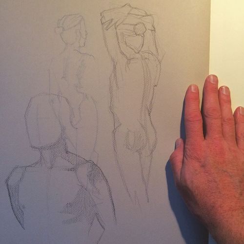
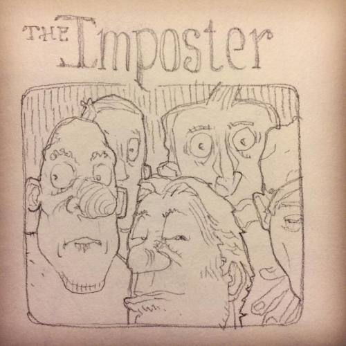
22 November 2016

PEOPLE WASN'T MADE TO BURN

via ILLUSTRATION ART http://ift.tt/2g6JDlj


In 1948, Ben Shahn illustrated an article for Harpers Magazine about the murder trial of James Hickman.

Hickman worked the night shift in a Chicago steel mill to support his wife and seven children.  The family lived in a tiny attic in a tenement slum, in one of the few neighborhoods where African Americans were permitted to live under Chicago's racially restrictive zoning rules.  Hickman tried to move out of his apartment but his landlord refused to return Hickman's security deposit.  The landlord  told tenants that if they raised problems, he knew "a man" who would come burn them out of their homes.

On the night of January 16, 1947, Hickman was working at the mill when his apartment caught fire.  The apartment was unsafe, with no exits, fire escapes or extinguishers.  His children were trapped inside.  When he returned the next morning his neighbor said, "Mr. Hickman, I hate to tell you this, four of your children is burnt to death."  They found the body of Hickman's 14 year old son under the bed, futilely trying to shield three of his younger siblings from the flames.


The Chicago police made no serious effort to investigate the landlord.  As the months went by, the anguished Hickman, devoutly religious, obsessed more and more about the babies that he'd lost, and the lack of justice in the world.  He said, "some day they would have married, someday they would have been fathers and mothers of children...."


Eventually Hickman got a gun and at God's instruction killed the landlord.  Finally motivated, the Chicago police arrested Hickman.  He freely admitted what he'd done, saying, "Paper was made to burn, coal and rags, not people.  People wasn't made to burn."

The prosecutor put Hickman on trial for first degree murder.  He was surely headed for the gallows, but then the story took an unusual  bounce.  The other tenants in Hickman's building angrily organized into the Chicago Area Tenant's Union  and combined with the Congress for Racial Equality (CORE) to publicize the case and support Hickman.  An outraged public rose up.  The ACLU defended Hickman and the jury refused to convict him.  

Harpers Magazine hired the distinguished journalist John Bartlow Martin to write about the trial, and renowned artist Ben Shahn to do the illustrations.  Shahn remained haunted by what he had learned about the case, and after completing the illustrations, he went on to create a larger, more allegorical painting about the tragedy.  Shahn transformed the fire into a flaming wolf / lion creature, with the children lying dead at his feet. 


Unfortunately, some officials-- already suspicious of Shahn's support for racial equality-- became concerned that the red beast might symbolize communism.  Henry McBride, writing for the New York Sun,  argued that Shahn should be "deported" for painting a pro-communist painting.

Shahn was indeed a socially conscious artist; he had previously participated in the WPA, where he worked with other artists who were interested in creating an American art that reflected the lives of ordinary people.  The following image, by another WPA artist, gives us insight into crowded urban life in the '30s for people of that class.


One critic noted that once the social injustice of the Great Depression and the existential threat of World War II had subsided,  former WPA artists became less interested in a representational, humanistic style:
Artists had to apply for WPA positions.  They were paid between $23 and $35 a month to produce a set amount of work every week.  "There were a lot of women participants... and it was very overtly welcoming to African-Americans....."  Perhaps because there was so much collaboration-- or because the artists wanted to keep their patron, the WPA, happy-- most of the prints remained representational and accessible.... "very focused on the present and engagement with the human experience.... The WPA officially disbanded in 1942, although artists continued to work in that style through Word War II.  But after the war, notions of art changed.  "The project developed a national identity that pulls away from the personal....After the war, artists reacted against it with abstract expressionism....It was a natural pendulum swing, I think, a reaction to the ways the WPA didn't speak to individual artists."        
Since the post war era, much of fine art has been self-absorbed and self-referential.  But it appears that there may be many opportunities for artists to play a socially conscious role in the years ahead.  It will be interesting to see how the art community responds.
_________________________

PS-- In 1948 the Supreme Court finally ruled that the racially restrictive covenants which had kept Hickman and other African-Americans confined to a narrow stretch of dilapidated, rat infested apartments were unconstitutional.  Here's hoping that the new appointments to the Court don't have a change of heart.


18 November 2016

Your Weekly Self-Promotion Routine

via Art Biz Blog http://ift.tt/2gjNNad

The Artist’s No-Excuse Weekly Self-Promotion Routine is printed on the inside cover of the 2011 edition of my book, I’d Rather Be in the Studio.

Five years is a long time in this fast-paced world, so it’s time to update that list and make it workable for late-2016.

A Sample Weekly Self-Promotion Routine

There is such a thing as a promotional campaign, but mostly I want you to think about your promotions as ongoing. You’re consistently sharing your art with the world. It’s a routine you commit to.

©Margaret Galvin Johnson, Sophisticated. Oil on canvas, 24 x 36 inches. Used with permission.

©Margaret Galvin Johnson, Sophisticated. Oil on canvas, 24 x 36 inches. Used with permission.

Perhaps it would be helpful to see what a self-promotion routine could look like. But before we get into it, I have a note of caution.

Don’t take this literally. This is just an example.

I don’t mean to imply that you should do these tasks on the day of the week that I assigned them to. Obviously, you should move things around to work with your schedule and goals.

Nor do I want you to think that you need to do all of these tasks every week. You might select one or two under each day for the current week.

Make it work for you!

As you work on your self-promotion routine, remember that your time in the studio is always your most important priority. Add it to your schedule before anything else. Without the art, you have nothing to promote.

With this in mind, let’s look at a sample routine.

Monday

Focus: Clarity

Review your calendar for the week and month.

Look for networking opportunities in the weeks ahead.

Review any leads or opportunities that have come your way. How can you follow up?

Tuesday

Focus: Venues

Review all of the venues and VIPs you want to keep your art in front of and leave meaningful comments on their Facebook pages.

©Alison Dickson, Havasu Splendor. Watercolor on paper, 30 x 22 inches. Used with permission.

©Alison Dickson, Havasu Splendor. Watercolor on paper, 30 x 22 inches. Used with permission.

Research grants, residencies, and show opportunities. Make time to apply to those that look like a good fit.

Check in with the venues and galleries you haven’t heard from in awhile.

Wednesday

Focus: Connection

Send three handwritten thank-you notes to people who have purchased your art, taken a class, or done something nice for you.

Send three postcards with your art on them – to galleries, venues, or anyone who might be interested in your art.

Thursday

Focus: Writing

Write a draft of your next newsletter or blog post. If you don’t publish weekly, review the ideas you have for future articles.

Friday

Focus: Winding Down & Preparing for Next Week

Schedule anticipated social media posts.

Acknowledge your accomplishments for the week and celebrate all that you have done.

Review your calendar for next week.

Every Weekday

Journal about your art because you’re a word-collector. You need words for your marketing.

Post your art to Facebook and Instagram. Tweet, if that’s your thing.

Write your gratitudes. Who are you grateful for? What are you grateful for? You will never receive more abundance until you are grateful for what you already have.

Recite your affirmations. It sounds super woo but I swear by it. Use affirmations to get yourself into a positive frame of mind and envision your beautiful future.

Saturday – Sunday

Play! Enjoy the down time that feeds your creativity.

©Patricia Scarborough, Promise. Pastel on sanded paper, 12 x 12 inches. Used with permission.

©Patricia Scarborough, Promise. Pastel on sanded paper, 12 x 12 inches. Used with permission.

Run errands. Carry a portable portfolio and a stash of business cards, flyers, or postcards wherever you go. You never know who you’ll run into that needs to know about your art.

Rest. Play some more.

Look over your upcoming week before heading to bed on Sunday night.

Your Turn

What does your weekly self-promotion routine look like?

02 November 2016

Anton Pieck (update)

via Lines and Colors :: a blog about drawing, painting, illustration, comics, concept art and other visual arts http://ift.tt/2eTUFHg

Anton Pieck illustrations
Anton Pieck was Dutch illustrator, printmaker and gallery artist active in the early to mid 20th century. I first wrote about him on Lines and Colors in 2010; since then new online sources for his images have come to light — in particular, a dedicated Anton Pieck website.

The site is in Dutch, but you can find his work easily under the menus at top for “Zijn werk“.

Pieck worked in an illustration style more in keeping with the “Golden Age” illustrators who preceded him, giving his work a nostalgic visual charm. I particularly enjoy his handling of architectural elements and natural forms like bare winter trees.

For more, see my previous post on Anton Pieck.

[Via One1more2time3’s Weblog]

 
Facebooktwittergoogle_plusredditpinterestlinkedin

Gonzo Sketching with the Great Ted Michalowski

via Illustration Concentration http://ift.tt/2eX91sL

14468242_10154147444014234_2242321415096126844_oYou have seen Ted Michalowski’s art on TV. He’s done courtroom reporting for ABC, CBS, CNN, all the major networks. He is an energetic part of the Scranton, PA art scene. When I say he is a ringmaster, it is not a metaphor, he has worked with the circus. His is a 4-time winner of the Electric City ‘s Best Visual Artist award. Once a month Ted takes over the New York’s Society of Illustrators to host their Sketch Night. He arranged recent the Gonzo Sketch night that celebrated the current Ralph Steadman exhibition. Steadman invented the visuals for Hunter S. Thompson’s stories in Rolling Stone that define Gonzo Journalism.

image8.jpeg

Ted recreated the Gonzo experience for 20 Kutztown illustration students. He brought the perfect Gonzo model, Ariel Krupnik. Ariel wore a coonskin cap, a feather vest, and what appeared to be an American flag kilt. A dead frog hung from his neck. Ariel leapt onto the conference table in the Society’s library and struck a pose. Ted’s bluetooth speakers blasted Elvis Presley’s  Viva Las Vegas!

sisketch

My 3-minute study.

Elvis screamed “Bright light city gonna’ set my soul on fire…” and Ted screamed over Elvis, “One more minute! New pose! Switch hands!” It was magic.

image4.jpeg

Ted Michalowski sketch of Ariel Krupnik

I first met my friend Ted at the Society of Illustrators. We sat at the same table at an ‘Educators who Illustrate’ conference. There was some gloomy chatter at the table about the state of education and illustration.  A fellow prof was moaning how teaching ruined his illustration career. It happens. Not every career choice is win-win. Ted and I make a conscious effort to keep our conversations posi, shorthand for positive. Whenever anyone, myself included, complains about a lackluster student, we refuse to let the conversation end until we consider an amazing student.

JessPaleyGonzoSketch.jpeg

Sketch by Jess Paley

One of my amazing students said Ted’s Gonzo drawing lesson was the highlight of her illustration life.

image7.jpeg

At one point Ted instructed the students to draw with their opposite hands. Then he had students pair up and two people drew on a single page with their opposite hands. I asked Ted where he had learned this mind-boggling technique. He told me it was brand new. He invented it that very moment with the Kutztown students. GONZO!

14519808_10210117340387020_6350676698879301961_n.jpg

photo by Kathy Sue Traylor

You too can draw alongside Ted at the Society of Illustrators. ($20 entry or $15 for students and seniors.) There is a rotating roster of great artists hosting the weekly Tuesday night event. There is often live music and  always live models. Ted is there once a month. Check the Society of Illustrator’s sketch night schedule. Stay Posi.

Shriner.Meredith.GonzoSketch.jpeg

Gonzo Sketch by Meredith Shriner

Some photos courtesy Ted Michalowski, Thanks. Thanks also to the wonderful staff at the Society of Illustrators, and to Prof. Ann Lemon for organizing the field trip.

Eye Candy for Today: Jean-Etienne Liotard’s Chocolate Girl

WARRING WITH TROLLS, part 9: SPECIAL ELECTION EDITION

via ILLUSTRATION ART http://ift.tt/2eYqajd

"To live is to war with trolls."    -- Ibsen

Congressman George A. Dondero (Republican from Michigan) was convinced that art is a communist plot.   In his impassioned 1949 speech to Congress he explained how art undermines the morals of America:  
As I have previously stated, art is considered a weapon of communism.... It is a weapon in the hands of a soldier in the revolution against our form of government.... The evidence of evil design is everywhere....  The question is, what have we, the plain American people, done to deserve this sore affliction that has been visited upon us so direly; who has brought down this curse upon us; who has let into our homeland this horde of germ-carrying art vermin?...
 (From the Congressional Record, First Session, 81st Congress, Tuesday, 16 August 1949.)

Dondero spent a lot of time carefully analyzing how each school of modern art contributes to the destruction of America:
1.  Cubism aims to destroy by designed disorder.
2.  Futurism aims to destroy by the machine myth
3.  Dadaism aims to destroy by ridicule.
4.  Expressionism aims to destroy by aping the primitive and insane.
5.  Abstractionism aims to destroy by the creation of brainstorms.
6.  Surrealism aims to destroy by denial of reason.  
Dondero and his fellow patriots were particularly agitated about immigrant artists (or "germ carrying art vermin") coming into the United States:  "Legér and Duchamp are now in the United States to aid in the destruction of our standards and traditions.  The former has been a contributor to the Communist cause in America; the latter is now fancied by the neurotics as a surrealist...." 

Other Congressmen on the House Un-American Activities Committee in 1951 were similarly concerned about immigrant art vermin, such as artist Arthur Szyk.  Szyk had escaped from Hitler in 1939 and came to the United States, where he became a relentless propagandist against the Nazis.


His cartoons infuriated Hitler, who put a price on Szyk's head. Eleanor Roosevelt welcomed him as a "one man army."   Szyk adored his adopted land and did many drawings and paintings praising its freedom:


However, after the war ended certain Congressmen became suspicious that anti-fascist immigrants might also harbor Communist sympathies.  They launched an investigation of Szyk in April 1951. Although Szyk denied any affiliation with communism, the old and frail artist died of a heart attack four months into his investigation, on September 13, 1951.

It's ironic that while Congressman Dondero was fulminating about threats to the country from modern art, the CIA was secretly subsidizing abstract expressionism as part of the cold war against the Soviet Union.   Spies on the front lines were spending substantial sums weaponizing modern art by Jackson Pollock, Willem de Kooning and Mark Rothko as part of a culture war, while Dondero and his fellow patriots were defusing the CIA's work.  

Stalin, sounding very much like Congressman Dondero, was equally paranoid about the impact of modern art, which he called "ideological sabotage against our country and especially against our youth...." Stalin complained that
attempts are being made against socialist realism in art and literature.... In these so-called abstract paintings there is no real face of those people, whom people would like to imitate in the fight for their peoples’ happiness, for communism and for the path on which they want progress. This portrayal is substituted by the abstract mysticism clouding the issue of socialist struggle against capitalism.
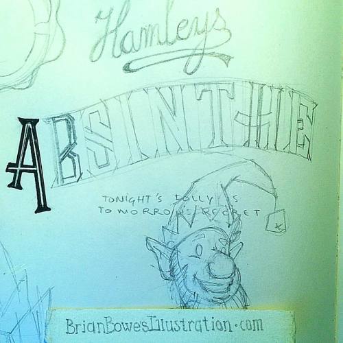
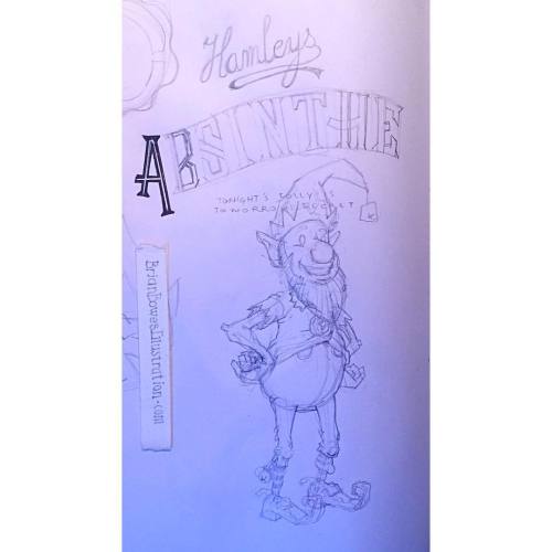

Salt and Pepper

via Muddy Colors http://ift.tt/2ez97nD

-Jesper Ejsing

In my studio, I am known for having the terrible tendency to abandon perfectly good drawings and start all over on an image that has nothing wrong with it. If it sounds stupid; well, it is. And it also results in frustration and late deadlines and all kinds of trouble…but artistically it has made me better.

I often sketch very, very loosely in the thumb stage. I look for shapes and rhythm and simplicity. When the pose of a figure an all that is settled I start actually drawing the details and the design of the figures and this is the point where I usually go astray.

First version. 
I actually fully painted this version before starting allover. This is a really good example of an illustration being the first idea drawn out with no analysing or reevaluation what could be better or clearer. Just the first angle and line that comes to mind.


Second version with the sketch pushed with better angles and foreshortening.

Final version

Here is what I look for: I want a figure first of all to be believable. That means the pose has got to be natural and the gesture true to the mood. I think gesture and facial expressions are the key to a good character pose.  If the pose, gesture and expression look right, it sells the believability of a vampire demon wizard with a troglodyte familiar better. If you know what I mean. The design comes later, fitting the dude or dudess with equipment and so on…

After all is sketched I go through the tedious process of transferring it to a board or paper where I draw in the background from my thumb sketch. This is usually the first time I see the full image as it look before I will have to wip out the paint and start adding brushstrokes, so this is also the first time where I actally start thinking about the final painting and how it will look. Up until now I have deliberately tried to trick my brain by deviding the task up into small easy digestable bites. Having all of the elemnts of theprocess in the head at the same time makes it very confussing. But the down site is that I do not get to evaluate the full image rightly until now. And this is always this stage where I abandon my image and start all over.

First thumbnail

This is also the point where I have had the image approved by an artdirector, so having to redo everything is not as easy as pie. I have to stay very close to the approved sketch or make life difficult for everyone ( I prefer to make life difficult to only me and my closest friends and family. Everyone in my nearest presence is affected since my mood is heavily influenced by the abyss of utter failure where I now try to hold the balance and walk the edge )

Second version

I transferred it to the board and when i was about to ink it i noticed that she was not seen from the same angle as the elephant. I redrew the figure directly on the board from a new thumb pose sketch. It turned out to be one of my best magic illustrations.

Final drawing on board
Most of the times the thing that went wrong was me starting to design to early on a figure where the gesture or pose or expression was not dead right. I go on to polish a turd rather than looking and evaluating the sketch. If I haved moved forward to fast and missed the cut feeling check to the foundation of the figure and told myself: “this is good enough, Jesper. Do that crazy armor you had in mind now. The face will fall into place later”, it never does.

IF I go to this stage with a wrong drawing I get that hard voice in my head that says “ you can do better than this. You should have done better than this. This is mediocre…but if that’s okay with you?”

Now here comes the worst part: I do an average of 60 illustrations a year if I also take vacations.  The average living span of a man in my region of the world is 78 and a half year. Lets say my last 6 months is kind of slow, and lets for good measure say I do the full menu. I am 43 now. It leaves me with 35 yeas of painting dragons. It totals at 2100 paintings to go, before I go. So when my mind asks me is mediocre okay with you? I answer, “No the number 2099 is gonna be the best I can be, I only have 2098 left…you see where this self torture is going? None of these are happy thoughts. They give me an unnessesary pressur einmy everyday life. But the times where I have let a mediocre painting go trhoug and I sit there looking at the final thinking I should have pulled myself together and repainted it when I had the thought, I feel ashamed and not proud of that drawing and worst of all not proud of the whole process. I have reached the conclusion I would rather start all over and do something that makes me happy rather than sitting back with the feeling of having wasted mine and the clienst time.

Lets go to the positive part of this. Nuff said about dying now.

What I have learned or gain from this immense self criticism is always to push my drawings for more. I will do anything I can to make sure that I have tried everything possible to make it feel right, and if it doesn’t, I take a new piece of paper and do another one, and another one and so on, until my cut feeling say “hell yeah”. I look for twist and angles in every hand gesture, I try to exsaturade a pose beyond the first idea and even if it looks good, I test if it could look different if I bend it or turn it or mirrior it and so on. I push it, and push it and then I push it just for the sake of pushing it. I have a mirror in front of my desk where I hold up my pencils to see them in reverse to spot if something is amiss.

This thumb was approved but when I was about to sketch it up on board I went back to the sketching stage and pushed the pose some more. 

This is pretty accurately describing my drawing and sketching process. I wish I was better at drawing, I think it would help me through many problems, but I am as good as I am. I wish I was one of those artists that thinks of the image a lot before they draw and then like a kind of printer draws out what they had in mind; well I am not. I wish a lot of things, but bottom line is I am a “Pusher-Man”, I make up for my lack of talent by pushing what I have to the brink. I think it has taught me a lot to do this. It has made me more critical about my own stuff and has helped me to evolve in each and every painting. I know it has kept me from stalling out art-wize and it has helped me to be proud of what I do…I will trade that for almost every struggle on the road .

Brad Bird Quotes About Animation

via Gurney Journey http://ift.tt/2fvhLZ6

(Link to see the video on Vimeo)
Film Editor Kees van Dijkhuizen Jr. put together this respectful tribute to director Brad Bird (Incredibles, Ratatouille, Iron Giant) by combining his quotes with clips from films that illustrate his ideas. Via Cartoon Brew


Here are some more Brad Bird quotes (Via AZ Quotes and IMDB):

"We make films that we ourselves would want to see and then hope that other people would want to see it. If you try to analyze audiences or think there's some sophisticated recipe for success, then I think you are doomed. You're making it too complicated."

"I think all movies are an illusion, whether they are live action or animation. And I think the best special effect that people don't pay enough attention to is caring about the characters who are going through the set pieces. If you can be invested in the characters that you are putting in danger, then you can amp up the pressure, and it really means something because people are rooting for them to survive. Characters are the special effect."

"When caricaturist, Al Hirschfeld, did a drawing of a celebrity, it often looked more like the person than the person did. That's our goal in animation."

"I think there's a tendency [among some animators] to wink at the audience so much that you feel that you're above the world that you're presenting—like the filmmaker doesn't really believe in the world that he's putting on screen. And there's a safety in that, because if you try to make the audience feel something besides comedy, like if you try to make them feel moved, you risk looking really silly if it doesn't work."

Bazaar Chase

via Blog - Alyssa Menold http://ift.tt/2e4iaAH

Just finished an interior for Shadowrun! I had so much fun designing the monocycle :D