29 November 2009

Portraiture in Watercolor

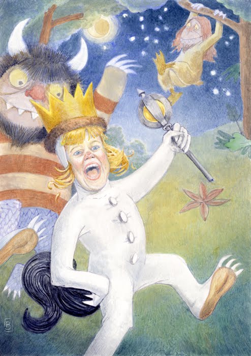
I am super happy to post this painting. I was honored to complete this portrait for some friends of mine who commissioned the piece after seeing the Paintings for Presents that I posted.

The concept to use their daughter as Max from "Where the Wild Things Roam," was serendipity at it's best. I'd been thinking about how to make this a piece that would be something different than the classic portrait. One of the places that I found inspiration was with Gustav Klimpt, in that he often uses the 2d and the 3d to great effect. So initially, I thought it would be something like a Klimpt, in that there'd be a bold shape, and the the figure would fit in it. As I went through some sketches, I happily stumbled upon Max. From there it was shooting reference pics to support the idea. Knowing that the images we'd taken at the playground would be my only reference, I shot many pictures, and endeavored to match one or two to a scene.

Technically speaking, the painting was challenging to work on. After arriving at a drawing that I liked, moving to a painting can sometimes be an opportunity to flub things up, but good. This is of course always the case, but we must persevere through those moments. So, I prepared the board, and smeared Cobalt Blue over everything but the Max suit which was to be white, and set into painting.

I tried my best to keep the momentum going for the painting, and to not allow myself to be bogged down in details to early. Following the 3 rules that I learned when first learning to paint in watercolors: Work big to small, back to front, and warm to cool.

In the end I enjoyed the concept and the process from gathering reference pictures, to drawing and painting the finished piece. There's just no way to express the feeling of making a blend happen 'just so,' or working life into the face. It is just a joy to paint, and to have others enjoy it in the end.

12 November 2009

Goggles Comic: Cover Up


Well, here is some work in progress { and I use that term loosely.}

I was working ahead with the cover image when a conversation with the author provided me with some crucial character info that I missed in my reading of the story... baddaboom, big baddaboom.

It turns out that the Goggles themselves need to be more chaotic, and wild. I think I can still save this image and add onto the drawing, it's still early enough in the process to make those kinds of changes. But I feel like a heel for missing that character element to begin with. So, I'll continue to try to save this image, and in the end if I have to burn it, so be it. But I'm not ready for that just yet.

Previous Post: here

03 November 2009

Studio Bowes Art Online Store: Grand Opening!

Studio Bowes Art Online Store

I am happy to announce the Grand Opening of the Studio Bowes Art Online Store! I'm posting up prints and posters, mugs, and my favorite, the skateboard! Check it out {here}

The proceeds from this online store will go towards sending Brian to the 2010 Illustration Master Class held in Amherst, MA. Please feel free to stop on in 24/7 to take a look, and if you don't see something that you'd like, I am more than happy to special requests.

Also available are personalized portraits. Handcrafted with watercolor, these can make for great gifts for the Holidays, Anniversaries, or Birthdays. Feel free to contact me directly through my portfolio site {here}, and read more about it on my blog {here}

Goggles Comic: Cover on Board

After sitting on this for a while, life's cleared up, and the next project is up and running. A friend and I have worked out a story, and developed it for release as a comic. And by developed it, I mean that he's written the darn thing, and now I need to deliver the art! Our objective with this project is to have a bit of fun, we're both comics fans, and decided that we'd give it a go. The plan thus far is to produce a sample of the work, and then approach a few different publishers, to see if they are interested, and if that fails, there's always self publishing.

After doing considerable thinking on the matter, the cover is going to be the first thing, then I will work out the pages. So, with out further ado, or a-doo-doo...

Part of my intent with this cover painting is to keep things quick and loose. I feel like often by the time a drawing makes it to the final board, a lot of life has been wrung out of it through tracing. So, I've intentionally left this one looser.

First a few free-hand color comps. I really like the earth tone pallet, but after some consideration, I started thinking about James Bama's Doc Savage covers, images here, I like the tone of his images, he pulls a hue as the major key for his images. Which I thought would work better for a comic cover ( I do actually want people to buy this!)

I started working using white to knock back the background. The image below was started with a wash of orange, then knocked back with chinese white. There's an intentional halo around the edge of the shadow and figure, my hope is to create a little edge vibration, especially between the blue shadow and the orange edge.

Now, the drawing is on the board, and at least one thing has changed from the preliminary drawing, notice the tentacles along the bottom edge, which I am seeing as being in the foreground. I think they help to really emphasize the danger that our heroine has walked into.

I'll apologize now for the quality of the photo, it's just a snap shot that I bent around in photoshop to get the lines to show up.