25 December 2009

Merry Christmas... now get to work!

Hey all, so Dame fortune and Santa have smiled upon me and delivered me two book covers to paint. I am very happy to be ushering in 2010 with some illustration work.

Here's both the brief's that I've received thus far, hopefully the manuscripts will be emailed to me soon so I can parse out some more details.

The Chieu Hoi Saloon
It’s 1992 and three people’s lives are about to collide against the flaming backdrop of the Rodney King riots in Los Angeles. Vietnam vet Harry Hudson is a journalist fleeing his past: the war, a failed marriage, and a fear-ridden childhood. Rootless, he stutters, wrestles with depression, and is aware he's passed the point at which victim becomes victimizer. He explores the city's lowest dives, the only places where he feels at home. He meets Mama Thuy, a Vietnamese woman struggling to run a Navy bar in a tough Long Beach neighborhood, and Kelly Crenshaw, an African-American prostitute whose husband is in prison. They give Harry insight that maybe he can do something to change his fate in a gripping story that is both a character study and thriller.

Here are the thumbnails for The Chieu Hoi Saloon. After reading the brief on this story, I felt that it was a story about a reconciliation between Harry's past and his present. I drew a strong connection between his Vietnam War experience and that one of the other main characters is a Vietnamese woman. As a supporting element I realized that LA/ Long Beach and Vietnam both have a lot of palm trees in them.
The first thumbnail reads quite well and is graphically very strong. The viewer is looking down on Harry as he's walking along a boardwalk/ sidewalk. The shadow is cast as that of a soldier; his shadow is his past self. The palm trees help to frame him and reference both LA and Vietnam. This is my personal favorite. It works well from across the room, and communicates an idea from the story. There is still some room to communicate the feeling and mood of the story here as well.


The second thumbnail is another variation on the shadowy past, but in this image we're in closer on Harry, and his shadow is cast upon a wall next to him. I think there's some room here to draw connections between a pitted and scarred wall, and the lined and weathered face of Harry. It is a more personal perspective.


{P.S.: see the final product here}

Pike:
Douglas Pike is no longer the murderous hustler he was in his youth, but reforming hasn't made him much kinder. He's just living out his life in his Appalachian hometown, working odd jobs with his partner, Rory, hemming in his demons the best he can. And his best seems just good enough until his estranged daughter overdoses and he takes in his twelve-year-old granddaughter, Wendy.

Wendy bears with her all of Pike’s failures to his family, enough heartache to last a lifetime and a few unanswered questions about her mother's death. And, following in her wake, a dirty cop named Derrick Kreiger, who carries an unhealthy interest in the girl. Pike, Rory and Derrick circle, evenly matched predators in a human wilderness of junkie squats, roadhouse dives and Cincinnati slums, with Wendy at their epicenter.

Here we have the Pike images. I worked around some ideas about what is at the core of this story. There is a "past coming to the present and having to deal with it" theme. Also I noticed a theme of unexpected family, where in Pike has to deal with, and, defend his "new" grand-daughter. As it says in the blurb "Wendy is the epicenter," and so she's integral to the concepts up to now.
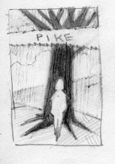
In the first thumbnail we see Wendy as a silhouette against a dark tree. I like this image, and feel that it has a graphic punch for a cover image. I like the metaphor of the family tree, and showing it as a dark foreboding shape. There's a lot of potential for this image, there's a great deal that can be communicated through her body language and facial expression. { this is where the details from the manuscript will come in handy } This one gets my vote.

The second image is more narrative by comparison, Pike is shown working on a broke down truck with Wendy close at hand. Here I am showing the broke-down family as the truck, where Pike has get in there and fix it. I've highlighted his forearm which will have tattoos on it, referencing a sorted past. Wendy is shown in contemplation of her grandpa's hand, and it is ambiguous as to whether or not she's actually going to reach up and touch his hand. I think that this image highlights the family dynamic, more specifically the relationship between Wendy and Pike.

And that's all for now folks, stay tuned for details as this develops.

29 November 2009

Portraiture in Watercolor

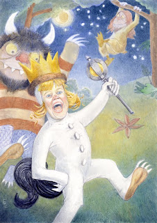
I am super happy to post this painting. I was honored to complete this portrait for some friends of mine who commissioned the piece after seeing the Paintings for Presents that I posted.

The concept to use their daughter as Max from "Where the Wild Things Roam," was serendipity at it's best. I'd been thinking about how to make this a piece that would be something different than the classic portrait. One of the places that I found inspiration was with Gustav Klimpt, in that he often uses the 2d and the 3d to great effect. So initially, I thought it would be something like a Klimpt, in that there'd be a bold shape, and the the figure would fit in it. As I went through some sketches, I happily stumbled upon Max. From there it was shooting reference pics to support the idea. Knowing that the images we'd taken at the playground would be my only reference, I shot many pictures, and endeavored to match one or two to a scene.

Technically speaking, the painting was challenging to work on. After arriving at a drawing that I liked, moving to a painting can sometimes be an opportunity to flub things up, but good. This is of course always the case, but we must persevere through those moments. So, I prepared the board, and smeared Cobalt Blue over everything but the Max suit which was to be white, and set into painting.

I tried my best to keep the momentum going for the painting, and to not allow myself to be bogged down in details to early. Following the 3 rules that I learned when first learning to paint in watercolors: Work big to small, back to front, and warm to cool.

In the end I enjoyed the concept and the process from gathering reference pictures, to drawing and painting the finished piece. There's just no way to express the feeling of making a blend happen 'just so,' or working life into the face. It is just a joy to paint, and to have others enjoy it in the end.

12 November 2009

Goggles Comic: Cover Up


Well, here is some work in progress { and I use that term loosely.}

I was working ahead with the cover image when a conversation with the author provided me with some crucial character info that I missed in my reading of the story... baddaboom, big baddaboom.

It turns out that the Goggles themselves need to be more chaotic, and wild. I think I can still save this image and add onto the drawing, it's still early enough in the process to make those kinds of changes. But I feel like a heel for missing that character element to begin with. So, I'll continue to try to save this image, and in the end if I have to burn it, so be it. But I'm not ready for that just yet.

Previous Post: here

03 November 2009

Studio Bowes Art Online Store: Grand Opening!

Studio Bowes Art Online Store

I am happy to announce the Grand Opening of the Studio Bowes Art Online Store! I'm posting up prints and posters, mugs, and my favorite, the skateboard! Check it out {here}

The proceeds from this online store will go towards sending Brian to the 2010 Illustration Master Class held in Amherst, MA. Please feel free to stop on in 24/7 to take a look, and if you don't see something that you'd like, I am more than happy to special requests.

Also available are personalized portraits. Handcrafted with watercolor, these can make for great gifts for the Holidays, Anniversaries, or Birthdays. Feel free to contact me directly through my portfolio site {here}, and read more about it on my blog {here}

Goggles Comic: Cover on Board

After sitting on this for a while, life's cleared up, and the next project is up and running. A friend and I have worked out a story, and developed it for release as a comic. And by developed it, I mean that he's written the darn thing, and now I need to deliver the art! Our objective with this project is to have a bit of fun, we're both comics fans, and decided that we'd give it a go. The plan thus far is to produce a sample of the work, and then approach a few different publishers, to see if they are interested, and if that fails, there's always self publishing.

After doing considerable thinking on the matter, the cover is going to be the first thing, then I will work out the pages. So, with out further ado, or a-doo-doo...

Part of my intent with this cover painting is to keep things quick and loose. I feel like often by the time a drawing makes it to the final board, a lot of life has been wrung out of it through tracing. So, I've intentionally left this one looser.

First a few free-hand color comps. I really like the earth tone pallet, but after some consideration, I started thinking about James Bama's Doc Savage covers, images here, I like the tone of his images, he pulls a hue as the major key for his images. Which I thought would work better for a comic cover ( I do actually want people to buy this!)

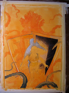
I started working using white to knock back the background. The image below was started with a wash of orange, then knocked back with chinese white. There's an intentional halo around the edge of the shadow and figure, my hope is to create a little edge vibration, especially between the blue shadow and the orange edge.

Now, the drawing is on the board, and at least one thing has changed from the preliminary drawing, notice the tentacles along the bottom edge, which I am seeing as being in the foreground. I think they help to really emphasize the danger that our heroine has walked into.

I'll apologize now for the quality of the photo, it's just a snap shot that I bent around in photoshop to get the lines to show up.

22 October 2009

It Figures...

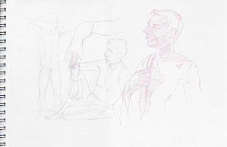
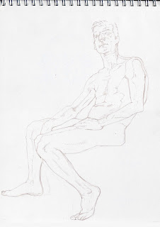
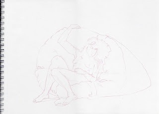
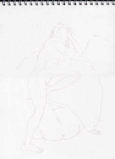
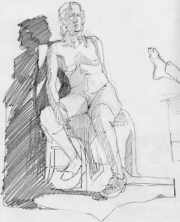
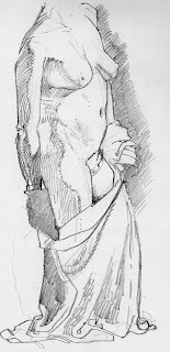
Well, so in this post, I am making up for a little lost time. These first three drawings were done on Oct. 7, two weeks prior to the time of this posting, and the rest of the drawings were created on Oct. 21. (My Uncle's B-day!)

While I do think that there's tons of stuff that's awkward about these drawings, you know some of the proportions are off and so on, but there is a feeling that is starting to emerge from within the process of drawing.

2 - 10 minute studies

40 minute study

40 minute study

Some of this feeling can be attributed to just making drawings for a long time, in other words, confidence is starting to seep into the work. That's a slippery slope right? Certainly I don't want to become over-confident, or over-confident's cousins, arrogance and ol' big head. There's no faster way to kill a drawing than a huge dose of ego. That being said, there is a feeling of... "goodness" that is happening during the process of drawing, a certain sense that the pressure is off, and the drawing is happening for the love of drawing. Because through this looking and observing there comes an understanding, or if not that at least an effort to understand what is being drawn.

2 - 5 minutes
20 minutes
20 minutes

1 hour

I feel like I am approaching the room that my first figure drawing teacher told me about. He didn't call it a room, he didn't call it a state of mind (although it is both of those), he simply uttered 4 words into my ear when he saw that I was struggling, trying to make the drawing just so perfect that I was all locked up, he looked over my shoulder and whispered in my ear, "Just fuck it up."

Now, it's taken reams of paper and years of drawing to begin to approach that place. From where I'm at it is a place where there's no hesitation, a deliberateness of mark making, a facility and a joy of drawing. A place where the judgement is suspended, and there's no time or space for self doubt. In short a place and a time where Fear has no place; Fearlessness. Who hasn't at some point had to enter a situation and had to put fear off to the side and just do it the best way you know how. It's a powerful place to come from. I don't know if it's a place we ever fully arrive at, there may still be those nagging critics in the back of our minds, but it's as good a place as any to aim for, and that's all we can do.

14 October 2009

Paintings for Presents

Greetings,

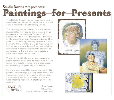
This year I am offering to do paintings for the holiday season. It will be a totally unique gift, created specifically for you or your loved ones. The above image is a flyer that contains more details, click on the image to see a larger version. Also, feel free to download it, or to pass it along to your friends. I am open to any reasonable requests.

This is a direct link to my developing online shop: Studio Bowes Art
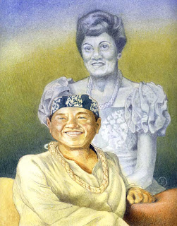
Here are larger views of the images shown above:

You can see earlier posts on this image here which show part of the process used to create this piece.

This is a sample page from my sketchbook.

You can find the story of this portrait here from an earlier post.

I hope that you find this idea intriguing and feel free to contact me with any related questions.

24 September 2009

The Return of Figure Drawing

I am so happy to say that the figure drawing sessions at CCA/ Illustration have resumed. One can never over value the power of drawing from life. In this particular instance I made three 20 minute drawings, submitted here for your perusal.

The following image was cobbled together in photoshop, just to give a sense of the page. While the patchwork of scans isn't the greatest, this image is only to give a sense of the whole page.
Prior to the drawing session, earlier in the day, I was in conversation with a friend regarding the work of Kent Williams. While we both agreed that there is some merit to doing straight master studies from an admired artist, that in the end that is only an exercise in seeing. While we both professed a love of his work, we both also agreed that there was already a Kent Williams in the world and that there really isn't a need for a second. Thus we were encouraged to follow our own paths. As my friend succinctly put it, "there is enough room here for all of us."

Having been thinking about what it is about Kent's work that I really like, one thing that came to mind is how he lays in his lines. No doubt after A LOT of life drawing that the artist grows accustomed to the form and can be more bold { or subtle } about their comments on the page. With this in mind, these drawings endeavor to be bold, more direct and then to allow the drawings to adapt over time. This of course can lead to distortions and misproportions, but after all these are drawings not photographs.


07 September 2009

Dorothy: Then A Strange Thing Happened...


"Then a strange thing happened.

The house whirled around two or three times and rose slowly through the air. Dorothy felt as if she were going up in a balloon.

The north and south wind met where the house stood, and made it the exact center of the cyclone. In the middle of a cyclone the air is generally still, but the great pressure of the wind on every side of the house raised it up higher and higher, until it was at the very top of the cyclone; and there it remained and was carried miles and miles away as easily as you could carry a feather.

It was very dark and the wind howled horribly around her, but Dorothy fond she was riding quite easily. After the first few whirls around, and one other time when the house tipped badly, she felt as if she were being rocked gently, like a baby in a cradle.

Toto did not like it. He ran about the room, now here, now there barking loudly, but Dorothy sat quite still on the floor and waited to see what would happen.

Once Toto got too near the open trap door, and fell in; and at first the little girl thought she had lost him. But soon she saw one of his ears sticking up through the hole, for the strong pressure of the air was keeping him up so that he could not fall. She crept to the hole, caught Toto by the ear, and dragged him into the room again, afterward closing the trap door so that no more accidents could happen."

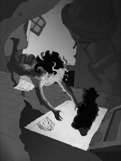
It was from this text in the Wizard of Oz, that the initial spark of inspiration flew for this piece. I was particularly struck by a few things here. One, that there is so much emphasis placed on the 'centered-ness' of not only the cyclone but Dorothy as well. Here her reaction is quite relaxed, what a Taoist might call the Wu Wei, or going with the flow. Secondly, there's the strangeness of the floating dog in the center of the room, that just sounded fun.

I owe a great big Thanks to everyone who helped me through out the completion of this piece; Zelda Devon, Rebecca Guay, Randy Chavez, Paris Raupach, and to my friends and family who helped keep my spirits up, thank you. The amount of learning that happened during the course of this illustration would be hard to quantify, certainly at each turn there was someone there to lend a helping hand.

Process wise, this piece was done in an effort to create a well composed, dramatic image, with a strong underling value structure. Consequently, it has seen numerous revisions along the way. This idea was germinated from the assignment options for the Illustration Master Class held earlier this year, due to personal reasons I was unable to attend and from there I realized that there was no need to hurry this piece along. In hindsight, that certainly allowed time and space for many small details to mature.

There will be another post later on reviewing some of the process tips I picked up and the journey from blank page to painting, but for now I hope you enjoy the image.


PS: to see the original post about this image and watch it all come together go to Post #1: Steampunk Wizard of Oz
to see the previous post about this image go to Post #3: Dorothy, as she is

23 August 2009

Dorothy, as she is


Well, the painting has been coming along, not quite fast enough for my liking, but it is still in progress. I wanted to just post up some images to show where she's at before heading off for some much needed vacation {I am wound tighter than a Tin Man's ticker} Watch for the thrilling conclusion in about two weeks after my return.

PS: to see the final post and the finished image go to Post #4: Dorothy, Then a Stange Thing Happened
to see the previous post about this image go to Post #2: Dusting off Dorothy
to see the original post about this image go to Post #1: Steampunk Wizard of Oz

11 August 2009

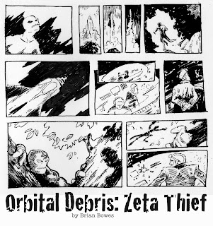
Orbital Debris: Zeta Thief

While waiting in a Doctor's office, some people read magazines while others knit. This comic page was waiting for me while I waited. It's a self directed comic, I was surprise to watch it emerge from my sketchbook. I didn't know it was in there, but here it is.

Comics are a great way to work out that narrative image making skill, with the addition of time. I've noticed that in, what I see as successful, single image pages the viewer can get a glimpse of what just happened, or what will happen, alongside what is happening in an image. With sequential art, there's all kinda space to play with time, place, as well as core story telling ideas like foreshadowing, metaphor and so on. Of course books have been written on the subject of comics and how to read and draw them, so I'll hold back the diatribe on comics... for now.

As I continue to delve into the world of comics {who knows, maybe there is work for me in the industry yet,} and develop styles and so on, I have to give a tip of the hat to some of my heros: Barron Storey, Bill Sienkiewicz, Sam Keith, John J. Muth, Jeffrey Jones, Berni Wrightson, and Stan Sakai. Each is a hero for different reasons. If I were to grossly hack these select few into groups, I'd have to say that Barron, Bill, and Sam would have to go into a bag labeled, "Freakishly Great Art and Story Telling." The remaining fellows could be slapped with a label that read, "Stories and Drawings to Make Angels Weep." 

This piece leans on lessons gleaned from Barron's classes, and tries to refine and incorporate the graceful inking of Jeffery Jones or Berni Wrightson. Having said that, I've got a long way to go!

05 August 2009

Dusting Off Dorothy


With more than a little help from my cattle prod wielding friends, I am happy to have brought Dorothy back to the edge of OZ. There have been many reworks of this piece since it was last posted on the blog, but well worth it. There's been some great learning experiences so far. You can visit where last we left Ms. Dorothy here, and after viewing that should handily be able to distinguish the two images. "Why, Brian," you may well ask, "why all the changes?"

Well, dear reader, to begin with my original intent with Dorothy was to have her floating between the two words, the gray and bleak of Kansas, and the emeraldy goodness of OZ, so the first change was the direction. A simple reflection upon the vertical axis, and already she's less planted on the floor boards and more sliding into the cyclone cellar. Then came the feet, I don't mind say, I've swept her off her feet. {oh hardy har har~}

Also I've simplified the image somewhat, and tried to focus more on her face and her reaction to all this whirling dervishness, and that's been done by creating a richer value structure. This is of course, the cornerstone to any narrative image, VALUE, VALUE, VALUE! I've had some real help with taking my sheepish values to a more dramatic place by one Zelda Devon, big props go out to her. There were a number of people who were very generous with their time and there informed perspectives. In the end I hope the piece lives up to all that was put into it. And that's the next step, painting. Look for the next post in two weeks.

PS: to see the next post about this image go to Post #3: Dorothy, as she is
to see the previous post about this image go to Post #1: Steampunk Wizard of Oz

04 August 2009

In the between times

Somewhat in preparation for the upcoming Dorothy piece, and for the experience of putting paint onto the page again, I've sketched out this SciFi scene. It's all free hand, so it is what it is. 

I've had some recent inspiration reading the July issue of Imagine FX magazine, especially the Justin Gerard article. I really admire his work and was fascinated to glimpse his process, and the way that he utilizes Photoshop to manipulate his image. For my tastes however, I can't get over loving to make a painting. There's a certain thrill in that for me. Sure, as I stare at the blank page I am certain that I don't know what the hell I am doing. That's just a crucible that has to be passed through. I am told that other's have similar feelings, that doesn't make it any easier however. 

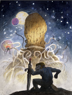
This piece is just a fun little thing. A giant tentacled creature, a spaceman wielding a broad sword and protected by his t-shirt and fish bowl helmet! {some of you may be able to spot the artist who's work I've been drinking in lately..}

Dorothy's up next, stay tuned.

02 August 2009

Art Auction Wrap-up

I'll start by thanking everyone who helped to make this poster sale a success. A Gigantic thank you to Brent and everyone at Shinteki who brought me this work, and took the extra time and effort to have the auction on Ebay. They have tireless energy and are super fun to work with. A thank you goes out to each and every person who put bids on the work, it is an honor and I am touched by your efforts.

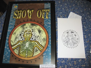
Brent brought the posters over to the house to have them signed before they are to be shipped and distributed to their new rightful owners. Each poster got a signature and a message to the buyers on them. (see above)

This was the first occasion I actually had to see the final posters. It was really fun to see them at size, and then to compare them to the original drawings that I had scanned in, it was something like a 300% increase in size. I have to say, bigger is better in this case. However it does drive home the point that I picked up from David Lance Goines that if if doesn't work small, it isn't going to work big.


In the end, I am really happy with the turn out for this project. It was fun to generate 7 pieces in about 2 weeks, and to fortify some computer-art skillz. Then to seem them so warmly received, and to have them go on to have extended uses beyond their originally intended use is such a delight.

22 July 2009

Art Auction!


Hey everybody,

I am so excited to announce that Shinteki is holding an art auction of the posters that I did for a recent game puzzle of theirs. Evidently there was a positive response at the games, and Shinteki have generously decided to hold an auction for the game pieces! The auction goes through to the 27th of July.

I am really happy and really touched that they'd put in this extra effort. We already knew they were great people, this just goes to further the point! So check it out, make a bid, and you might be the lucky one!

You can also see the original post about these works here and here.

07 July 2009

Sketchbook Moonwalk


I wanted to just post up a page from my sketchbook. Recently I've been coming back to drawing and painting just for the fun of it. I am still working on the Wizard of Oz piece which has a more serious side to it. For reasons of my own sanity I've come back to drawing for enjoyment, and this page is simply that.

01 July 2009

A quick fling


One can never tell where things are going to go next! A friend of mine has a mother whose something of an entrepreneur. We were introduced to each other last year and she hired me to do some simple story boards for a PSA for her company No Kiddin' Condoms.

This year, she was on her way to an event where women inventors compete. As it turns out the designer she thought was going to prepare her 'pitch poster,' basically flaked out on her, and in a panic she called me up. My solution was quick and dirty, I figure it took me about 7 hours from beginning to end.

I don't suppose this will turn the world of illustration and design on its ear, but I am happy to have been able to pull it off, get paid, and have it look not half bad.

*PS* January 2010: additional post "Rush Job" for this same client.

17 June 2009

Steam-punk Wizard of Oz


One of the projects for the Illustration Master Class in Amherst MA was to create a cover image for a steam-punk retelling of the classic "The Wonderful Wizard of Oz."

Conceptually this combination of two worlds is ripe with possibilities. It is an area that I hope to mine for a few more pieces. The first piece is the cover image, and these are my preliminary works for that.

The scene I've chosen for the cover is from the beginning of the book, when Dorothy and Toto are in the cyclone over Oz. In the book, there's a moment when Toto falls into the hole where the cyclone cellar was, Dorothy rushes over to save him. Only to find that he's buoyed by the air pressure of the cyclone. I chose this scene because it allowed me to show that she was falling into another reality. Around her will be the gray and drab world of home and below will be the radiant colorful land of Oz. I hope to heighten the effect with color as well, choosing desaturated grays and muted tones for the house, and vibrant golden greens for Oz.

Here is the compositional drawing. I am working on developing angles, trying to set the stage so that there is the possibility that Dorothy might fall into the hole. She should be right on the edge. There may be further refinements in this drawing later, simple things like lifting her heel up on her left foot, maybe pointing that right foot. Or, maybe I'll try switching the feet around so that the right foot is forward and the left is back. Clearly she'll need a top too. Those changes will be made after getting a model to pose for me and taking some photo reference. This will also help to add to the overall steam-punk style too.

Here we have the initial value pattern. Again, to heighten that contrast between the drab world that she's leaving and the luminous world of Oz, I've tried to keep the house in 50% gray, and kept Oz and Dorothy in 20% gray. A simple triangle or zig-zag pattern really. (I guess staring at those Hokusai prints flows out here and there.)

Now, we come around to the more finished value study. While I will make adjustments to bits and pieces of the drawing, this will be the template for the final piece. The area's that will receive some immediate attention will be Dorothy's pose, the whirling cyclone clouds (they just aren't whipping around enough for me yet,) and defining the Emerald city down there on the ground (right now it's some geometric shapes.) The Yellow Brick Road should also be a bit more clear after the color, right now it's the white line that leads to the Emerald City.

Stay tuned for more developments. I may be releasing some of my sketchbook sketches going forward too, just for fun. Please feel free to leave comments, I like to hear what other's think!

PS: to see the next post about this image go to Post #2: Dusting off Dorothy

09 June 2009

Portraiture in Watercolor


This most recent piece was actually set in motion about 6 months ago, in an auction to raise money for a local school, I donated a portraiture drawing session. What originally started off being a 1 hour drawing session has morphed into this watercolor painting.

The girl is about 5 years old and her parents were the top bidders who won the portrait. The way that the painting came about is that we arranged for me to come to the school and to do some life drawing on the spot. But little children often suffer from Antsy-pants, soooo, I brought my camera with me. What I ended up with was two nice drawings that gave good gesture and sense of her proportions, and 2 or 3 pictures that were worth anything. Feeling good about that, I came home to the studio and set to work. Obviously photo's give one the ability to really get the details of the face. I really tried hard to leave things as fresh as possible, but my early inclination was to turn her into an 80 year old woman by painting into every nook and cranny of her face! Of course children's faces are soft and round, corners and lines have yet to happen, and so my intention was to create a sense that the colors and values were just ever so lightly floated there.

Technically, I felt that I found a good stride with this painting. I enjoy small crosshatching marks, and with watercolor one is able to build a rich color and texture due to the transparent quality of the paints. My heros for this kind of mark making would have to be George Seurat, his drawings are positively sculptural, and Andrew Wyeth (who could not just LOVE the way that he created his final paintings.) This kind of mark making shows up in some of my pen and ink work as well. For me it's a great way to develop tone. This was really the first time that I employed this method in terms of creating a whole painting with it.

Another note that I was conscious of during the creation of this piece was edges. There is a big effort to display hard edges, and to balance that with soft edges. The soft blending along the cheek and nose area are of particular joy for me. The outer edge is another place where I wanted to show some softness, as well as the rough brush strokes on the paper. For this I looked to John J. Muth for inspiration, I find that his blends and backgrounds are rich with wet into wet blends, and sensitivity to color and edges. I have to admit it was a brave moment putting those moves on there. At that moment, I had the head and shirt done, and most of the hair. So, I had to take a deep breath and launch into that, and well, the results are there on the page.

Finally, speaking of the page, the paper itself is a handmade piece of watercolor paper from Twin Rocker in Illinois. I was gifted a sample pack of papers from them, which I adore. One thing that I didn't account for was their sizing (the glue in the paper), and the way that it accepted water. In other pieces I've painted on Strathmore board, and Arches Hot Press. This Twin Rocker paper really should have been soaked then stretched rather than painted directly onto, consequently the watercolor didn't soak into the paper very quickly. However the back side to that is that the color also lifts very easily; making corrections was a breeze. The rough nature of the paper and the natural surface were positively a joy to work on.

I hope I have more opportunities to do portraiture, it was really fun. If I am being really honest, I admire this piece for the things that it is to me. So many times, I can create something and find that in the end, I am still not quite satisfied with the results. Here, I am.

01 June 2009

Comic Book Finals

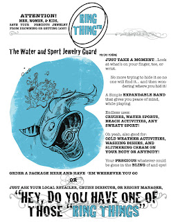
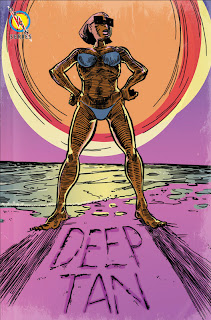
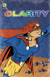
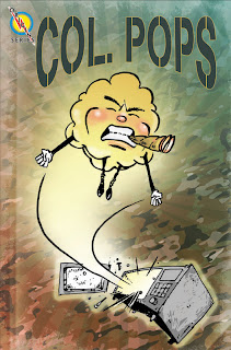
Ok, fun only begins to describe this project. Originally I was contacted by a really great company, Shinteki, who do games and puzzles for corporations as well as private events. Defiantly check out their website, it's amazing! So their latest challenge involved creating several faux comic book covers, that's where I come in.

The puzzle will be running until June 6th, and I will post the answer after it's all over and done with. I just couldn't resist posting the images though, because I enjoyed making them so much!

Process wise, I decided that for the sake of efficiency and authenticity I decided to delve into Photoshop to make these. They each had a very similar genesis, starting with sketches/ thumbnails, up to final drawing in some cases, then on to inking, scanning, and photoshop. Very similar to how I assume many comics are made these days.

I wanted these to have a somewhat classic comic look to them, with a dash of pulp, spiced with a little digital pizzaz. To those ends, I worked out some of the stressed features on the images; dog-eared corners, worn spine creases, and faded and stressed edges.

An interesting side effect of streamlining the creative process was I found some unusual color choices, that I wouldn't have made had I done these traditionally. I guess there can be a certain fearless quality to laying down color in the computer, simply because it is so impermanent.


Even though I was using photoshop, I did make an effort to to use too many filters, and to use the effects in photoshop judiciously. Although I may have gotten carried away here and there, c'est la vie.

So, go ahead, these are the clues. I don't know if there was a prompting question on the actual puzzle, but all the information is in the images (or else it wouldn't have worked!) Give it a shot, and send me your solutions, for each correct solution I will give you a free drawing! Deadline's June 6th.