
19 February 2018
Day two off the Illustratharian Workshop was full of laughter, creativity, and sharing. ✒️📘✨

18 February 2018
Luke Buck

Luke Buck is an Indiana native who paints crisp, bright landscapes in acrylic, watercolor and gouache.
In addition to painting subjects in his home state, Buck is working on a project to paint in every state of the union.
You will find both original paintings and limited edition reproductions on his website.
Many of his paintings have a compositional device in which the primary image is in a crisp rectangle, created by setting off the image with tape, from which key elements extend outside of that area, often with the addition of drip effects at the bottom.
Buck has a step-through demonstration of his process here. He also conducts workshops, demonstrations and art talks, both in Indiana and other states.
His website also has a listing of shows and plein air events in which he is participating.
17 February 2018
Exciting! Tom Banjo and I will be co-hosting the Illustratharian Workshop today! Happy Year of the Dog! • • • • #HeyTomBanjo #Sketch #illustration #kidlit #kidsbookstagram #kidsbooks #picturebooks #childrensbooks #kidlitart #picturebook #childrensbook #childrensillustration #BrianBowes #Fun #Joy #SimplePleasures #characterdesign #santacruz #BenLomond #FireOnTheMountain #BerryGoodJams

14 February 2018
Here’s hoping that you’re enjoying a laugh or two on this fine Valentine’s Day. ✨💖✨ • • • • #HeyTomBanjo #Sketch #illustration #kidlit #kidsbookstagram #kidsbooks #picturebooks #childrensbooks #kidlitart #picturebook #childrensbook #childrensillustration #BrianBowes #Fun #Joy #SimplePleasures #Pencil #ColoredPencils #pencildrawing #sketchbook #theartofslowliving #kidsbookstagram #seekthesimplicity #happyvalentinesday #ScarletBegonias #DaysBetween #LoveLight

13 February 2018
With a glop of Colonel Corn’s Stick ‘Em Up Glue, and the sole from an old worn out shoe, Tom and Jer’ Bear were on the road again. • • • • #HeyTomBanjo #Sketch #illustration #kidlit #kidsbookstagram #kidsbooks #picturebooks #childrensbooks #kidlitart #picturebook #childrensbook #childrensillustration #BrianBowes #Fun #Joy #MississippiHalfStep

12 February 2018
You never know when Bongo Bunny might bounce by to say “Hi!” • • • #HeyTomBanjo #Sketch #illustration #kidlit #kidsbookstagram #kidsbooks #picturebooks #childrensbooks #kidlitart #picturebook #childrensbook #childrensillustration #BrianBowes #Fun #Joy #BongoBunny #JerBear #UncleJohnsBand

11 February 2018
We all need a tender friend like Jer’ Bear. • • • • #HeyTomBanjo #Sketch #illustration #kidlit #kidsbookstagram #kidsbooks #picturebooks #childrensbooks #kidlitart #picturebook #childrensbook #childrensillustration #BrianBowes #Fun #Joy #santacruz #pencil #cartoon #supportlocalartist #drawingoftheday #bookart #character #RUKind #UncleJohnsBand

10 February 2018
Even Tom gets the blurs. • • • • #HeyTomBanjo #Sketch #illustration #kidlit #kidsbookstagram #kidsbooks #picturebooks #childrensbooks #kidlitart #picturebook #childrensbook #childrensillustration #BrianBowes #Fun #Joy #Blues #drawing #characterdesign #pencil #BlackMuddyRiver

09 February 2018
These two are the traveling kind. • • • #HeyTomBanjo #Sketch #illustration #kidlit #kidsbookstagram #kidsbooks #picturebooks #childrensbooks #kidlitart #picturebook #childrensbook #childrensillustration #BrianBowes #Fun #Joy #SimplePleasures #thatauthenticfeeling #littlestoriesofmylife #AreYouKind #PlayingInTheBand #MountainsOfTheMoon #MississippiHalfStep

08 February 2018
Tom’s facing his fears. • • • #HeyTomBanjo #Sketch #illustration #kidlit #kidsbookstagram #kidsbooks #picturebooks #childrensbooks #kidlitart #picturebook #childrensbook #childrensillustration #BrianBowes #Fun #Joy #SimplePleasures #santacruz #pencil #cartoon #supportlocalartist

Ol’ Jer’ Bear is still pickin’ those Flat Tire Blues. • • • #HeyTomBanjo #Sketch #illustration #kidlit #kidsbookstagram #kidsbooks #picturebooks #childrensbooks #kidlitart #picturebook #childrensbook #childrensillustration #BrianBowes #Fun #Joy #SimplePleasures #JerryBear #TomBanjo #littlestoriesofmylife #atticsofmylife

03 February 2018
Art Tip of the Month #6: Masking Fluid
My art tip this month is: Art Masking Fluid When you need to mask off a part of your surface that you don’t want to get paint onto, art masking fluid is versatile enough to block off both broad and complex areas. In this video, I give you tips to using this timesaving product. …
Skintones?
In preparation for an upcoming commission, I decided to retest the extremes of what I could could do with skintones. In this case I decided to go with a near opposite range of tone from what most would consider ‘traditional skintones’. For this exercise, I instead, stepped deep into the chroma of green to use as the base for a balanced sense of tone on a nude, that would still be perceived as being ‘naturalistic‘.…
Sketching to Learn About the Subject
With each job there is a period of research and referencing, getting acquainted with your subject matter. This is my favorite stage of the jobs I do, learning about people, places, technologies, biology, astronomy, astrology, etc. This part of the job not only connects me with my subject matter, it’s my level up time, learning a weird, not so weird tidbit of history that could very well better connect me with what I am creating.
Experience makes subject matter more convincing, more believable, more involved, as we paint our knowledge, our history, our interactions with it into each brush stroke. Smelling the oil burning, hearing the metal scraping away, the feeling of the spinning wheels can add life to the setting where otherwise I would just paint it to finish it if I didn’t know any better.
Design or background elements can be treated theatrically, aesthetically, purely for the visuals and sometimes just naively chosen because it is close to what the subject matter calls for. I choose the more involved direction by thoroughly studying the subject and committing it to memory.
I went to the Steam Engine Museum in Vista California to research and reference some material for a series of images that require an old, steam an old dilapidated building with old generators in it that need to be started. Not only does the museum have more than enough steam engines, it also has an awesome blacksmithing barn with several work stations that look like a scene right out of Peaky Blinders or Godless. The museum offered more reference than I had time to study.

Time quickly flew by and I could not draw fast enough to make objective decisions with all my drawings. I do make it a point not to spend the entire time drawing, but spend most of it looking, interacting, using all my senses to take in the moment. Then I go back and make quick notes that will help me later with memorizing the subject.
I learned that this, the Enterprise DSW-6 gas generator was one of 3 used as a primary then later as a standby generator for Palomar Mountain Observatory, and during its lifespan there between 1938 – 1996 and was used for a total of 4800 working hours making this thing practically brand new. And it is the only one left in existence.


The museum runs it every now and again, at their events, and whenever someone like me comes along and asks if someone would demonstrate it working. It has a mesmerizing chugging sound to it and the ground vibrates a little from the spin of the flywheel.

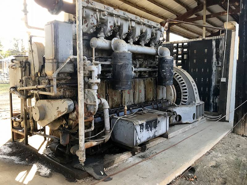

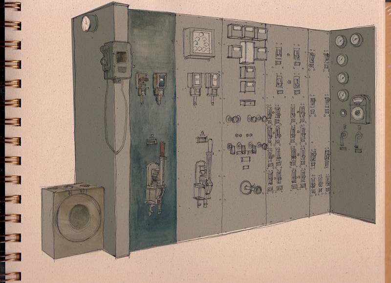
I take a studio’s worth of materials with me when I go on these excursions, so I have plenty to work with and all options are available to work with. I drew my sketches with open line drawings to leave room for color to design the volume. I also drew several maps, and detail sketches working on various paper types that would hold up to the markers, paint, graphite, and pens I was using.

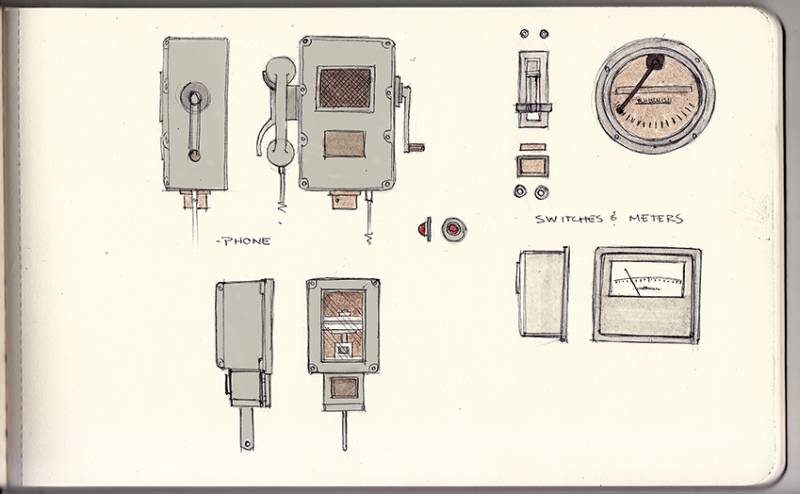
Knowing that I had specific goals to achieve, I kept the sketches simple and shape driven to memorize their graphic relationships and proportions to each other. From there I made a few drawings from several different angles, starting only with the base shapes, ignoring the smaller shapes that would only confuse the overall structure.
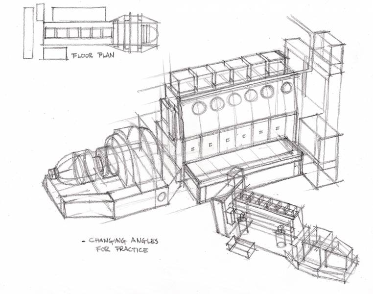

When you head out to sketch, give yourself a goal. If it is to study something you plan on using in an illustration, I have made a checklist below with many options and goals to search for. Isolating each item pulls focus into your observations and helps solve problems quicker than just loosely sketching because it is necessary.
Here is a check list for when you are out on the field:
- The scale and the volume
- The sound(s) and their intensity/loudness compare if you can to other sounds
- Smells and odors
- Animation(s) of item
- Time of day you experienced it and whether there is a “best” time of day for it
- Texture(s) feel them if you can
- Color palette
- Container Forms for construction
- Patterns for detailing
- Labels and Decals – extra details we otherwise miss
- Weight
- Materials – Construction and Make up
- Interact with it if you are allowed
- Recall the steps in operating it and how tough were they?
- Feeling/Vibration/Shaking/Physical interaction
- Unique and Distinct Attributes, Sounds, etc.
- Take photos and more importantly take video footage. You can frame grab from it much easier than you can remember something in motion in your only still images shot from the experience
Get involved with your subject matter. Use all your senses or as many as you can in your interactions and remember your experiences. This careful observation and memorization, the experience and the involvement, is the key to more options and more creative options in your designs and drawings.
10 Things About CONTRAST
When my students get into trouble with a painting and it looks flat and dull, even if the composition is solid, most of the problem is a lack of contrast.
A painting can suffer in so many ways…too similar values, similar shapes, similar light, similar color…all work to destroy depth. You get one chance to pull off depth in an image and it isn’t dependent on just foreground, middle ground, and background. Depth is created by contrasting multiple factors at once.
The idea of using contrast can’t be separated into one tidy thought. These aspects all relate to one another, commingle and affect each other. In these points below, I’ve gently eased them apart to help understand the concept. Read through the list and use it to evaluate your recent work and plan for future success.
Edges
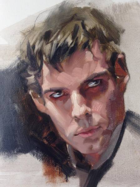
A sharp edge can pull an element forward to the front of the picture plane and a soft edge can push it back farther into the design. The reason is the difference between the abrupt stop or the transition of the edge. The difference can allow the artist to control not only the depth, but where a viewer will spend time looking.
Value
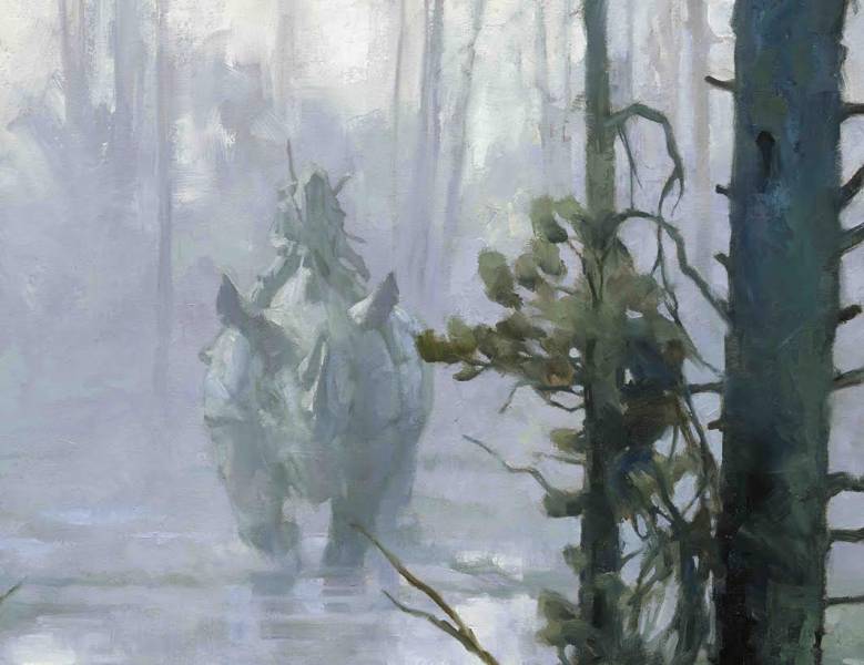
To simplify this aspect, think: dark values fall back, light values come forward. But it can work just as easily the opposite way. Lighter elements can fall back in an overall light image while a darker object can then jump forward for attention.
That’s just the extremes. Subtle values can push and pull the viewer, too. It’s the contrast between the two that grabs attention.
Problems arise if similar values are in the background and the foreground. It causes the image to flatten. Think of the highlight on a helmet, or glint in an eye, matching the white of mountain snow in the background. Similarly, imagine rocks in the foreground having the same value of the color on a horse in the background, or every fold of a shirt having the same value overall. If they all match, volume is lost and the depth fails.
Color
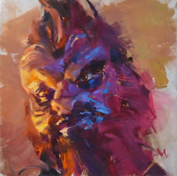
Small accent colors set against broad, dull color passages create contrast and movement. Temperature differences, warm vs cool colors, can help offset or bolster a composition. Skin has warm and cool aspects no matter what race. The contrast brings depth to a face.
Focus
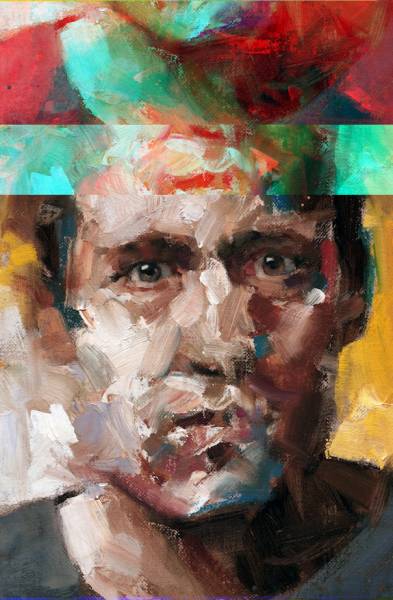
As with edges that shift in sharpness, the focal point of a picture can hang on the variance of which edges are sharp and which fall away. This can be done in broad sections…or along the very same edge. Our eyes detect multiple edge comparisons constantly, differentiating what’s important from what’s not. Alleviate your viewer from working too hard, which leads to eye fatigue.
Light
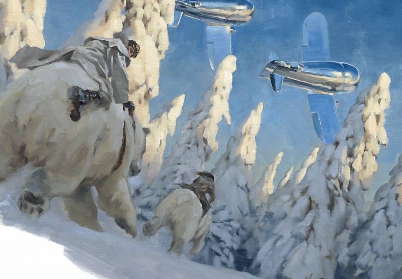
I’m not talking about just value shifts, but the actual light falling on the overall scene. Fill Light is usually subtle while Key Light is sharp and bright. The contrast between the two is what you’re after.
The difference between shiny surfaces and dull will vary how light is reflected off of those surfaces. Just like velvet dresses in all those turn-of-the-century paintings, we know it’s velvet material because of the way the light strikes it and the way the artist mimics that reflection through value and shape. Satin has a different way of reflecting light, with different values and shapes. For example, wet hair picks up light differently than the the way dry hair scatters it. Contrast between the different surfaces fascinates a viewer.
Texture
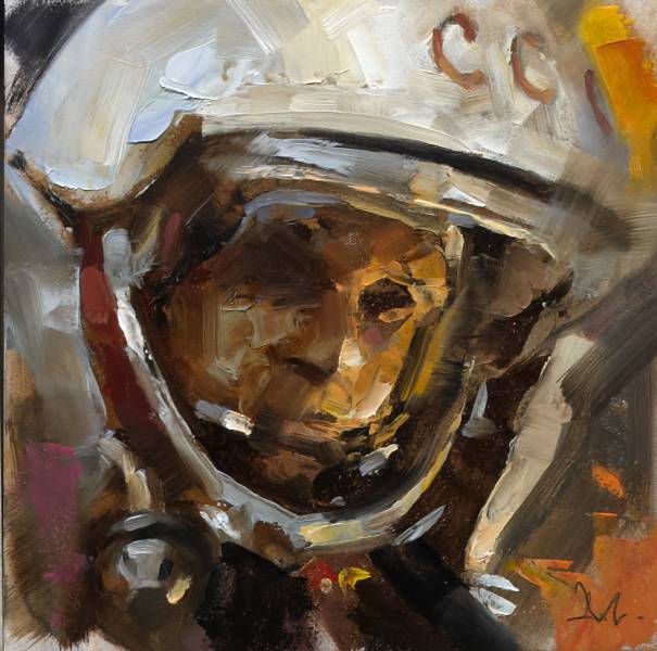
Texture is one of the simplest to build contrast because it’s easy to detect. The brain is very aware of surface texture. Smooth vs rough, chunky vs slick, scumbled vs refined. Like the edges above, detail moves forward in a composition while a lack of detail moves backward. Think of leather against fabric or leather against fur, metal against skin, glass next to brick, puddles against the rough sidewalk, soft fabric against the shiny surface of an automobile. It is the contrast between the two that you are after, not only the surfaces themselves.
Scale
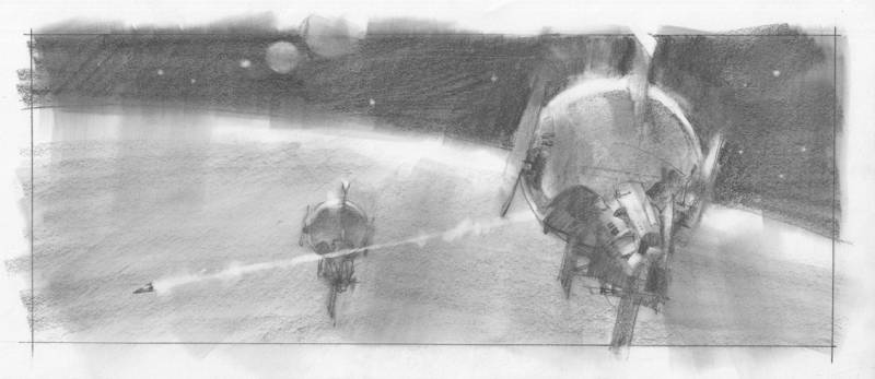
Large vs small elements in a composition create depth and interest. Big objects command attention, but not if they’re so large they become background. But then a small object in front of that large object can give contrast to grab a viewer’s interest. The difference between the two allows the brain to understand scale.
Pay attention to how large you make a small object, and how small you make a large object. Our brains want to keep things in the right scale. You can throw scale off for effect, but you’ll be asking the viewer to make the jump. The shift has to be convincing, whether you are fooling the audience or keeping it real.
Rhythm
Take birds for example, flying through a scene. If they are evenly numbered and perfectly separated from one another by the same space, they become uninteresting. If they are separated by scale but lined up with the same space around them, they still lose the effect of depth.
Once they overlap and vary in number, or are grouped sporadically, they build a varying rhythm that an audience loves to look at. It is the contrast of varying the sizes of repeating forms that builds depth and interest.
&n
bsp;
Shape
Speaking of varying things, varying shapes is a must. You know this already. If all shapes are the same size in a composition they go flat. That’s ok if one is working to create a graphic approach for an image. Think wallpaper.
Vary the shapes of a forest or even the branches of a single tree. The human figure varies in all of its shapes. Arms are not tubes, legs are not stilts. Clothing varies its folds, as do mountainsides, landscape, brushwork, texture.
There are very, very subtle differences between what we think of as similar things. Smoke vs clouds, or steam. A sunset glow vs campfire light, or flashlight. Hair is shape; grass is shape; leaves are shape. Study the differences and paint those varying shapes.
Depth
To understand it, keep it simple: you can build depth by the contrast of:
scale: large vs small
shape: detail vs broad
texture: rough vs smooth
light: bright sun vs overcast
color: saturated vs greyed
value: dark grey vs light grey
Everything about depth in a painting is about relationship between each element: from side to side, top to bottom, foreground, middle ground, and background. A combination of these contrasting aspects taken together give a painting depth.
Concept
The difference between ideas in a painting can add contrast as well. A simple portrait that is changed by something unexpected to the viewer provides renewed interest. A scene that’s expected to be shown a certain way, but given a slight twist can cause an audience to linger on the work. Unexpected color for an ordinary object contrasted with an ordinary subject. Lighting conditions that seem normal punctuated by a severely lit subject or element. A mechanical object combined with an animal shape, or an animal with mechanical shapes. An abnormal weather pattern in an otherwise peaceful landscape.
All of the above are not only principles, but suggestions. It’s a way of waking up to, and finding, ways to grab attention from a viewer and hold them there by interest. The human brain loves the contrast of alternating aspects and concepts. It loves to fill things in when given just the right amount of information.
That ‘curiosity of mind’ is what you’re after.
Izzy Burton's "Via"
"A short animated film that tells the journey of life through the use of epic, beautiful environments and meaningful character animation. It shows how we should open our eyes to the good things that happen every day, to the experiences we share with the people we love, and the silver linings and the lessons to be learnt in even the lowest times." (Directed by Izzy Burton, Blue Zoo Animation Studio, London)

Morgoth and the Silmarils : Part 1 of 2
Today, I am wading back into the Silmarillion to bring you widespread panic, epic conflict, devastation on a cosmic scale, and hopefully some interesting Photoshop tips.
The scene I am working on for this two-part series is of Melkor (now named Morgoth by a furiously angry Feanor) and the taking of the Silmarils. This is a global catastrophe for pretty much everybody in Middle Earth, except perhaps for Balrog real-estate agents. And we see all of this against the backdrop of the specific anguish of Beren, who has returned to see his homeland of Doriath burned in the battle of Sudden Flame. The goal of this composition is to collapse both these small and large concepts into a single image.
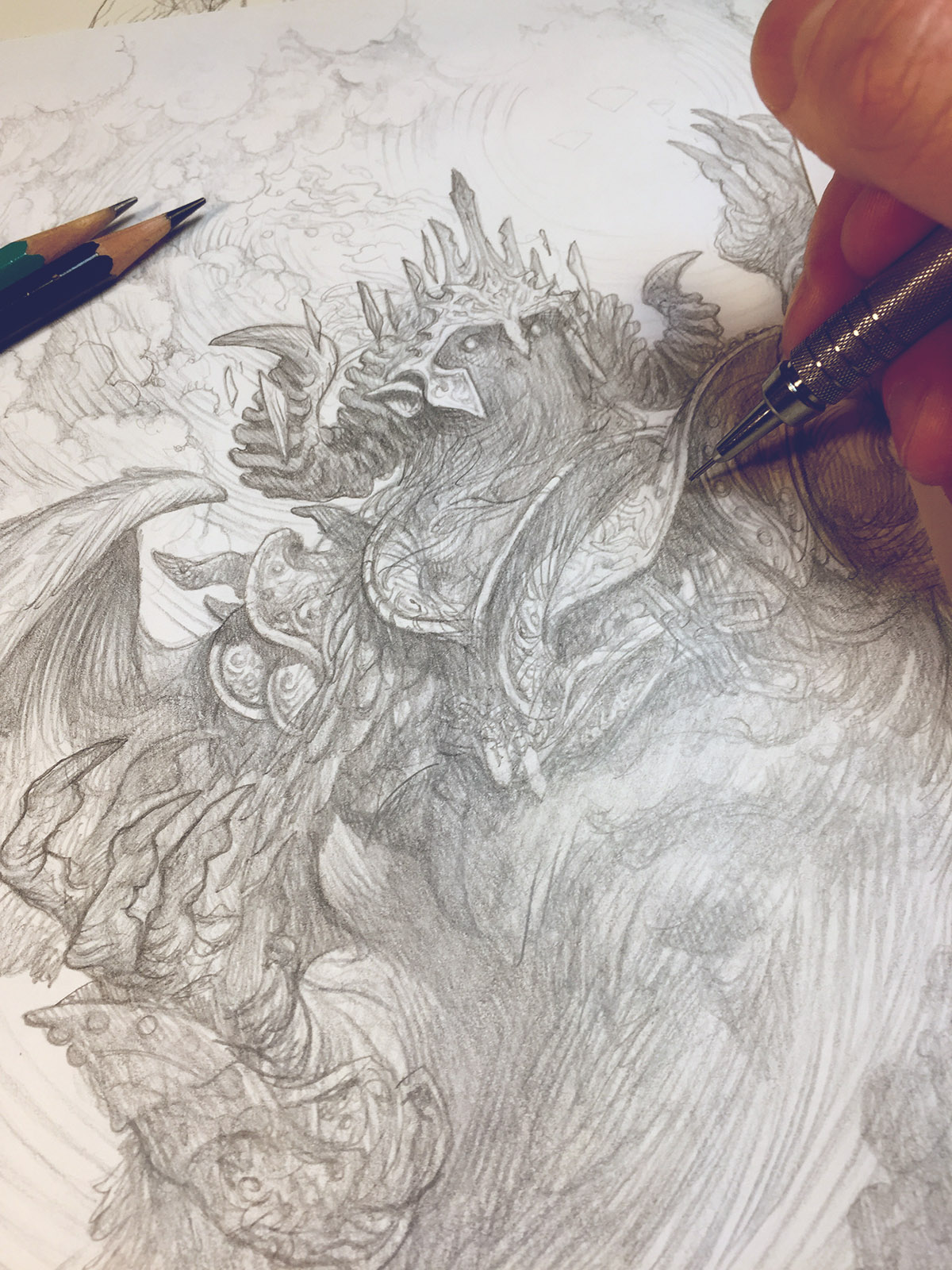
I always start these images as scrappy little ink drawings, which I have enlarged here, but really, they are just scraps of barely legible lines. From these I pick the one that strikes me the most and wrestle it into a photoshop file.
Quick tip: When making your early conceptual file, it helps to know what size you want it to eventually be. Going for a 16×20 painting? Go ahead and drop this composition into a file size of that dimension. It will save you headaches later.


Now that I know generally what my composition will be, I do some exploring. First, a quick monochrome pass in Photoshop to clean up and enhance my scrappy little ink drawing. This is very important as it establishes the lighting effect for the image. Line and value is the intellectual statement of an image, while color is the emotional. So for the feels I lay in some basic colors (in Photoshop) as my target for the final image.

After arriving at a color comp I am happy with I do studies to really flesh out some of the key elements in the image. I am not very rigorous about how I do these. I just start grabbing whatever paper or cats are around to draw these on. In this case I wanted to try out a new Daler Rowney drawing paper with a few Caran D’ache Pabo pencils.

Morgoth’s design proved initially very tricky. I liked him as a shadowy menace with only eyes in the color comp and this seemed to serve the narrative of the scene the best. But I also really want to draw an ancient, seared, withered, angel-elf, demi-god face. (It would just be fun! I shouldn’t need more of an excuse! And you’re not the boss of me, I can do what I want!) … After trying several versions with his face clearly visible in the composition and even giving the image the overnight test I realize that I just have to murder my darlings … and went back to the shadowy figure. (I’m still going to do an image with that face in it at some point though and you can’t stop me!)

Now that I’ve finished with all this over-wrought, preliminary procrastination, I finally begin the tight drawing. For this drawing I use lightweight bristol paper. For pencils I am using Prismacolor Turquoise pencils (an old favorite of mine) for the murky shadows, and a mechanical pencil for the detail-work. I use a small tablet light table to do the transfer.

In Part 2, I will be covering the digital painting of the image. For colorizing this image I will be doing something a little different than I usually do. First, I will be using more opaque layers and Photoshop’s blender brushes. Also, instead of working from a neutral mid-tone towards a fully saturated image, I am going to be starting with a dark and highly saturated base and painting in grays and complimentary colors to slowly work the image towards the color comp. It’s a bold move. Tune in next time to see how it plays out.

Curator Removes a Painting 'To Start a Conversation'
 |
| Waterhouse's Circe |
 |
| "Hylas and the Water Nymphs" by Henrietta R. Rae, who 'saw herself primarily as a painter of classical themes with a strong emphasis on the female nude' (Christies) |
 |
| Cartoon by Nik Scott |
Comments on Twitter: can use hashtag #MAGSoniaBoyce.
Contact Gannaway directly: via the Museum's website.


